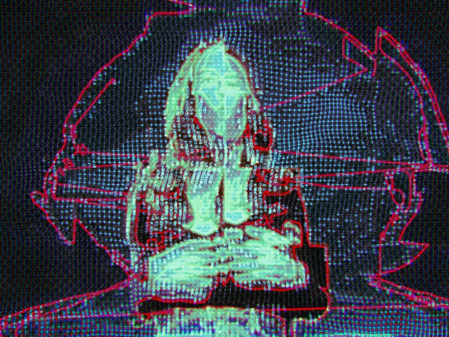
An installation for a classroom-sized room, about how political media talks. Seventy-seven videos from seventeen channels are read for tone, and the readings drive generated music and video effects on two facing walls. Visitors pick a video on a pad grid and turn nine rhetorical metaphors up or down on faders. It ran unattended at the ISLS conference at UC Irvine in June 2026.
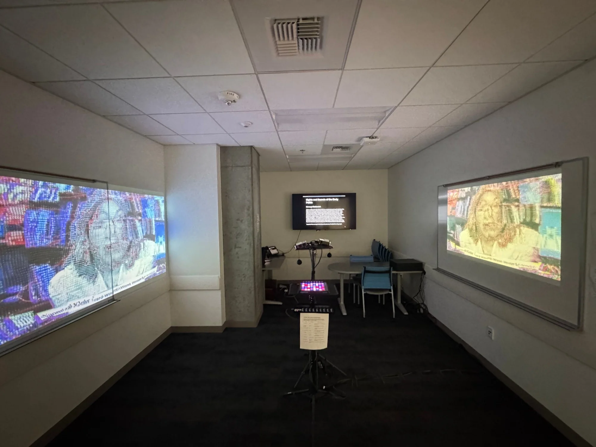
The room.
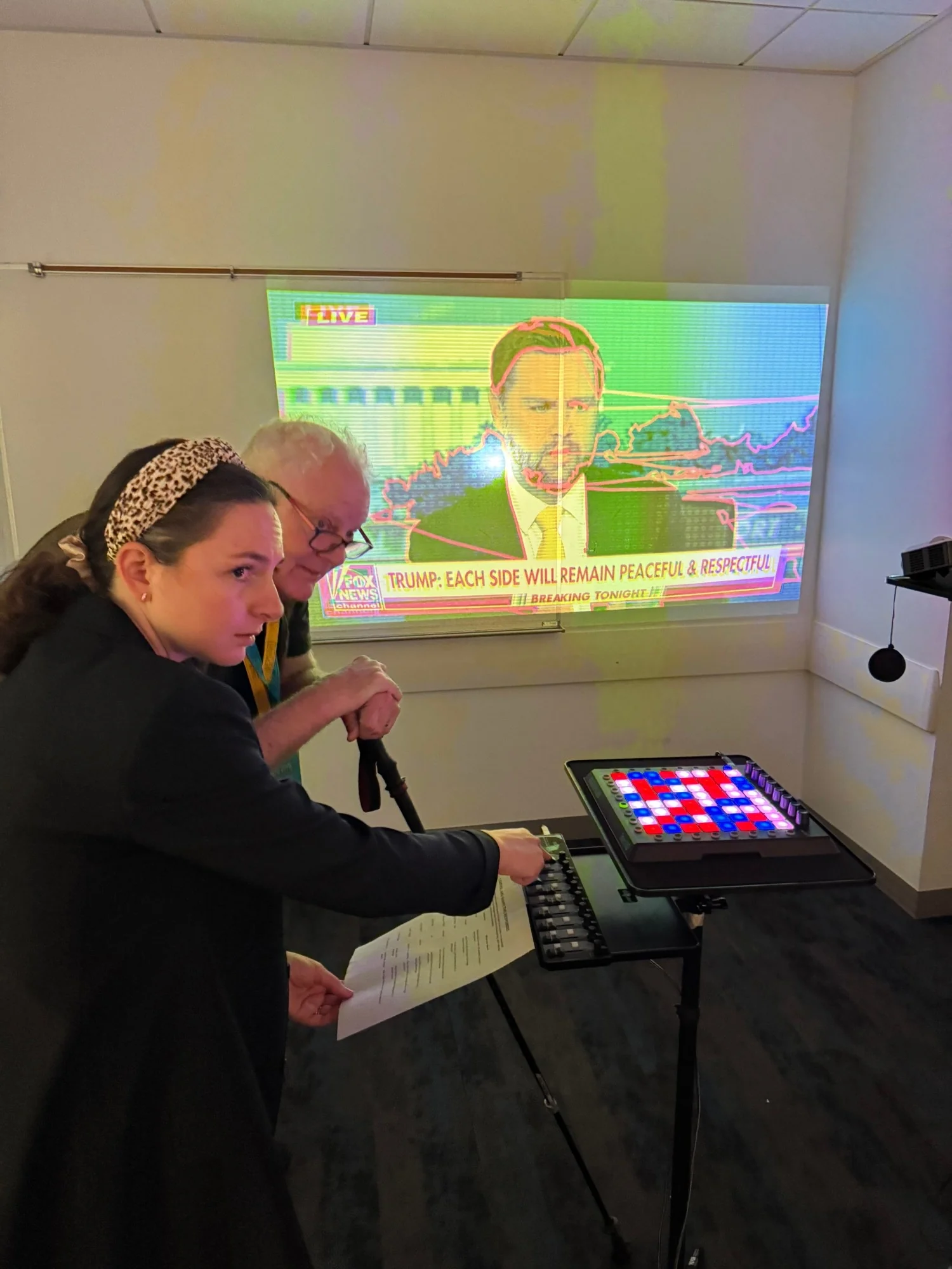
A projection on each side wall, the controls on a stand between them, and one speaker. A pad plays a minute of its video, redrawn, over music generated from its transcript. A fader turns one metaphor up or down in the sound and the picture at once. What any video says is beside the point.
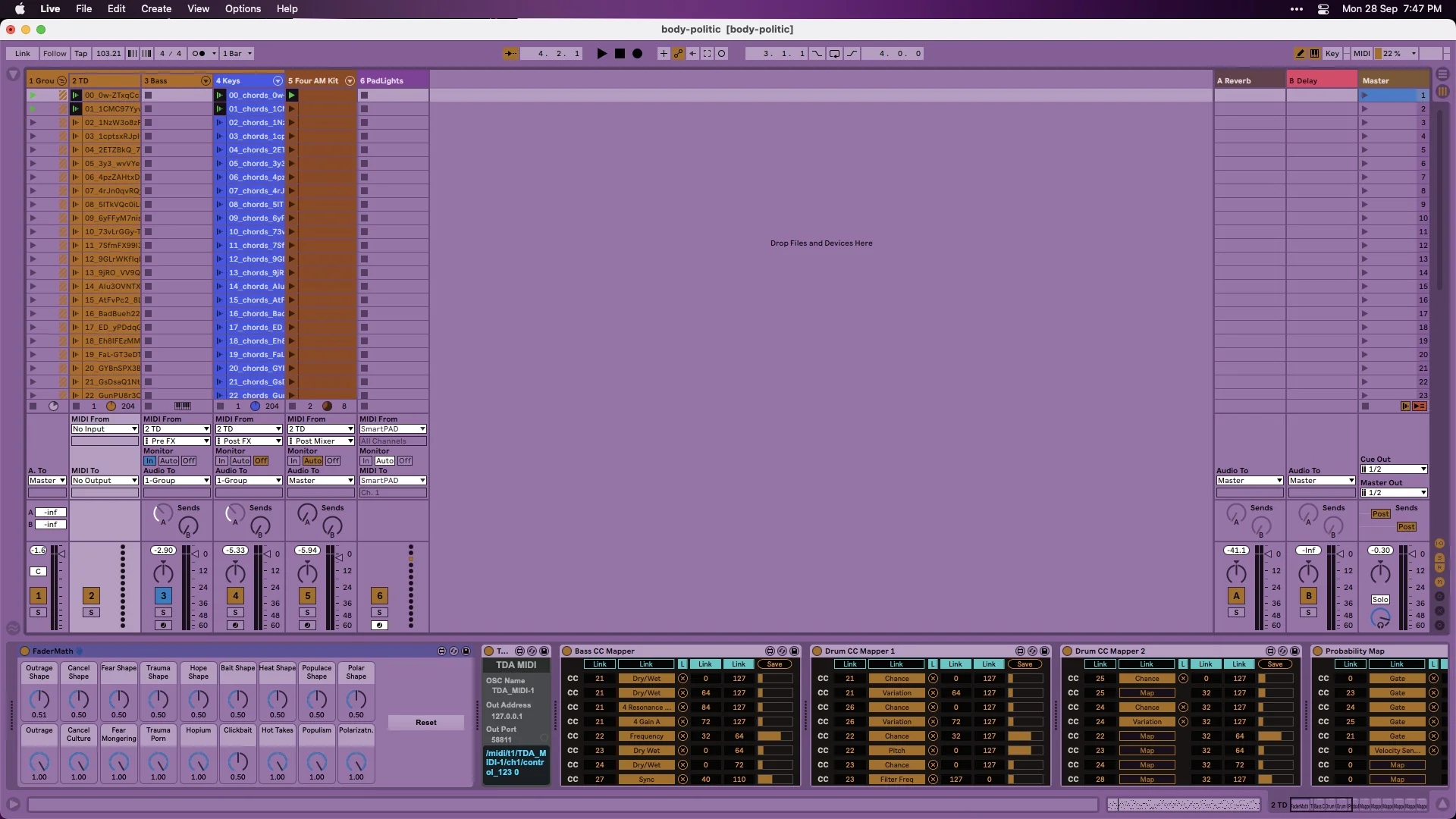
Nine metaphors, nine measurements.
Each metaphor is one measurement of a transcript. Six are emotions, read by an emotion model: outrage is anger, fearmongering is fear, hopium is joy, and so on.
The other three measure the language. Hot takes is how opinionated it is. Populism is how easy it is to read. Polarization is how far its tone swings from neutral.
Each reading drives one effect on the walls and a set of sounds at once. Overall intensity sets the tempo, 60 to 172 BPM, measured against the whole collection, so a calm video plays slow and a furious one fast.

TakenKeep the melodies in one key and carry mood through orchestration, timbre and tempo.
RejectedMajor for good news, minor for bad.
Takenj-hartmann's RoBERTa emotion model.
RejectedA go_emotions model trained on Reddit comments, and a word-counting lexicon.
Two controls, both bound.
The fader sets how loud a metaphor is. The middle plays the data as analyzed, and zero is silence, because zero fake news has to mean no sound. The knob sets which parts come through, from only the spikes to the quiet parts lifted. Solo and mute came off the controller: a fader at zero already mutes, and a solo left on would hide eight metaphors from the next visitor.
Trauma porn · Sadness
The politics only exist at the channel level. I tested three political-lean models on the same 50 chunks of transcript. Chunk by chunk they disagreed, correlating between -0.24 and 0.11. Averaged over a channel the signal was real, but only one model got both ends right, with Ben Shapiro highest and Democracy Now! lowest. Another ranked Democracy Now! the most right-leaning of all.
That model sets the split between the cold wall and the hot wall. The emotions drive the moment, and the politics drive the room.
premsa
- CNN
- Ben Shapiro
- Fox News
- Democracy Now!
- PBS NewsHour
politicalBiasBERT
- Ben Shapiro
- PBS NewsHour
- Fox News
- CNN
- Democracy Now!
matous-volf
- Democracy Now!
- PBS NewsHour
- CNN
- Fox News
- Ben Shapiro
Built to run with nobody watching.
The last stretch went into making sure nothing a visitor or the data did could stop the room.
I rebuilt the note gate so it couldn't stall. It thins the music when the data is calm, and clears a stuck note within five seconds. The bass reads its notes before the main track's effects, so a failure there can't take it down. The pad wall starts scenes itself, because Live swallowed the presses.
I led the UX, arranged the music, chose the models, built the devices and wrote the handoff. Sam Mejias brought the seed idea and supervised the music. The nine metaphors were a team decision.
 Me
Me Sam Mejias
 Kevin Ingco
 Negin Pazandeh
 Zuzana Bakova
- Jackie Brady
Looking back
The premise was data first, human on top, and it took three versions to believe it. The first had a performer blending their own playing with the data, and one knob turned all the way erased the data. We changed the math so no control could, then removed the performer and gave the visitor a narrower power: turning a metaphor up or down. The piece got better every time the human had less to do. That's uncomfortable to learn when your job is designing for humans.
Choosing the political model was circular, and I did it anyway. I knew which channels should land left and right, and kept the one model that agreed. We'd planned to anchor each video to its channel's position, but that was dropped in the build. So the walls follow a per-chunk score I'd called noise, smoothed until it moves slowly enough to look like meaning. I think most data art fails there: it turns noise into sound and calls it signal because it moves.
Some metaphors act out what they name and others critique it. Clickbait zoom-punches at you; cancel culture erases the frame into ASCII. We decided a piece can do both, because the media does. I still don't know if visitors can tell which is which, and I've decided that's the right amount of not knowing.
Handing it to someone else's machine was the last lesson. I wrote four handoff documents, a runbook, and a fix list for a failure that came back on Sam's laptop: after about fifteen minutes, the busiest devices fell behind and stopped. Sam applied the fixes without me, and it held. That's the only real test of a handoff, and designers rarely get to see it.