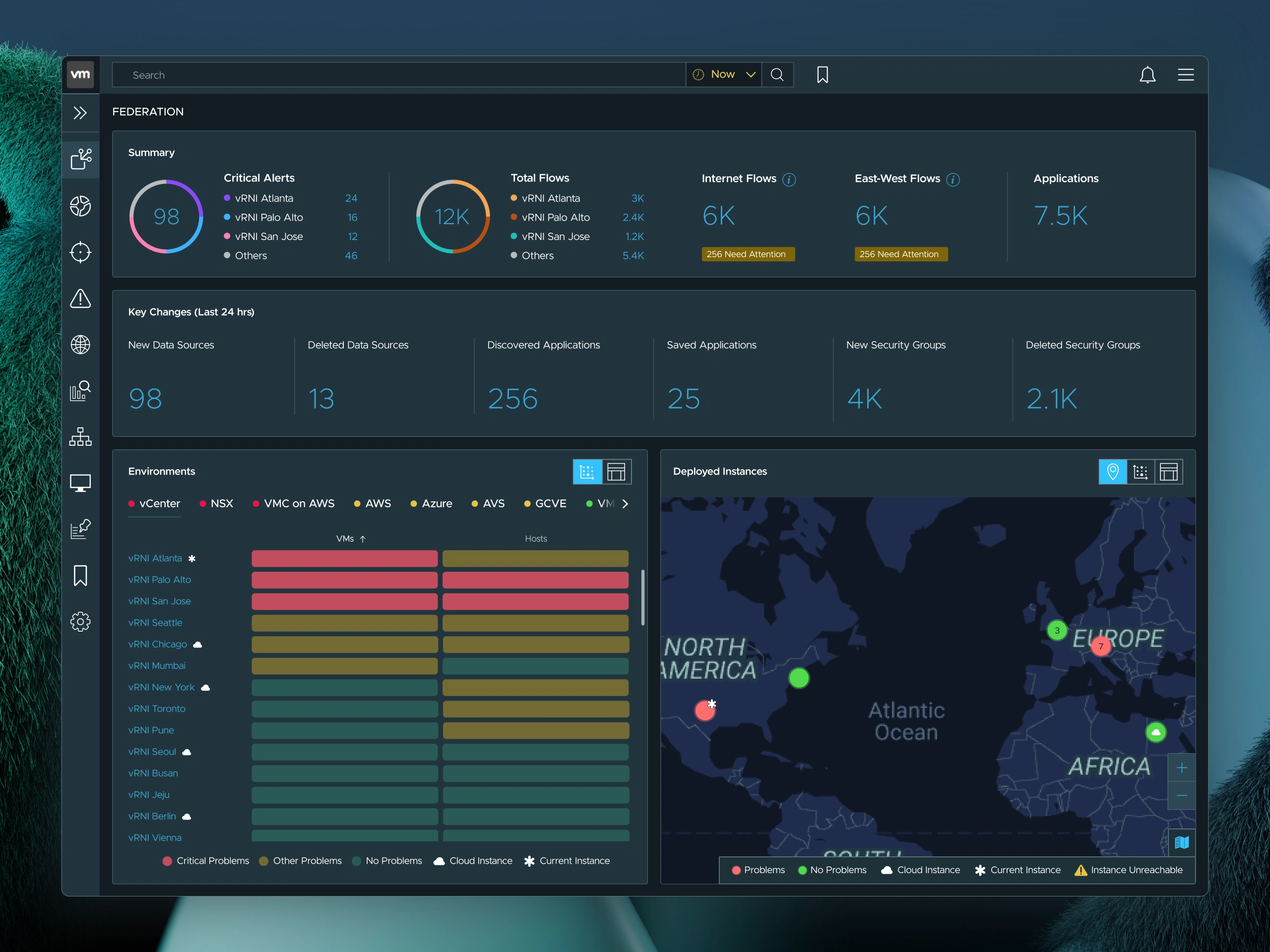
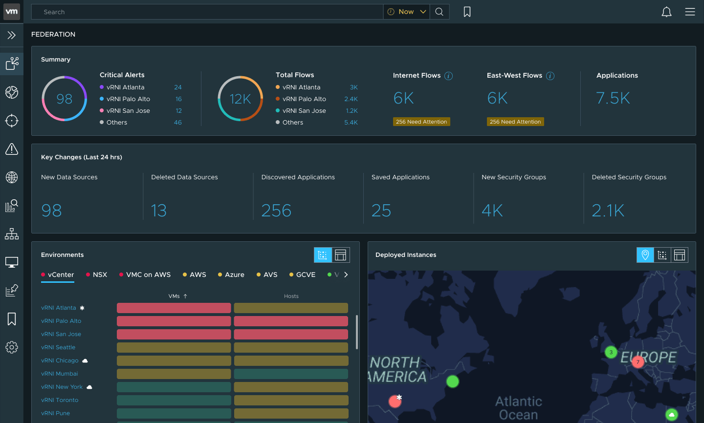
When VMware built network federation, teams had no fast way to see what was happening across their environments. I designed a dashboard that rolls health and alert signals into one view, with drill-downs into any instance for real troubleshooting.
Let's do some roleplay. You're a network admin at a company with offices in twelve countries. You're responsible for the health and security of everything* running across your organization's virtual infrastructure. Just business as usual.
So you log into an instance of VMware's network insight tool. You check the environments. You check the alerts. You check the flows. You move on.
You log into the next instance. Check the environments. Check the alerts. Check the flows.
You log into the next instance. Check the environments. Check the alerts. Check the flows.
You log into the next instance…

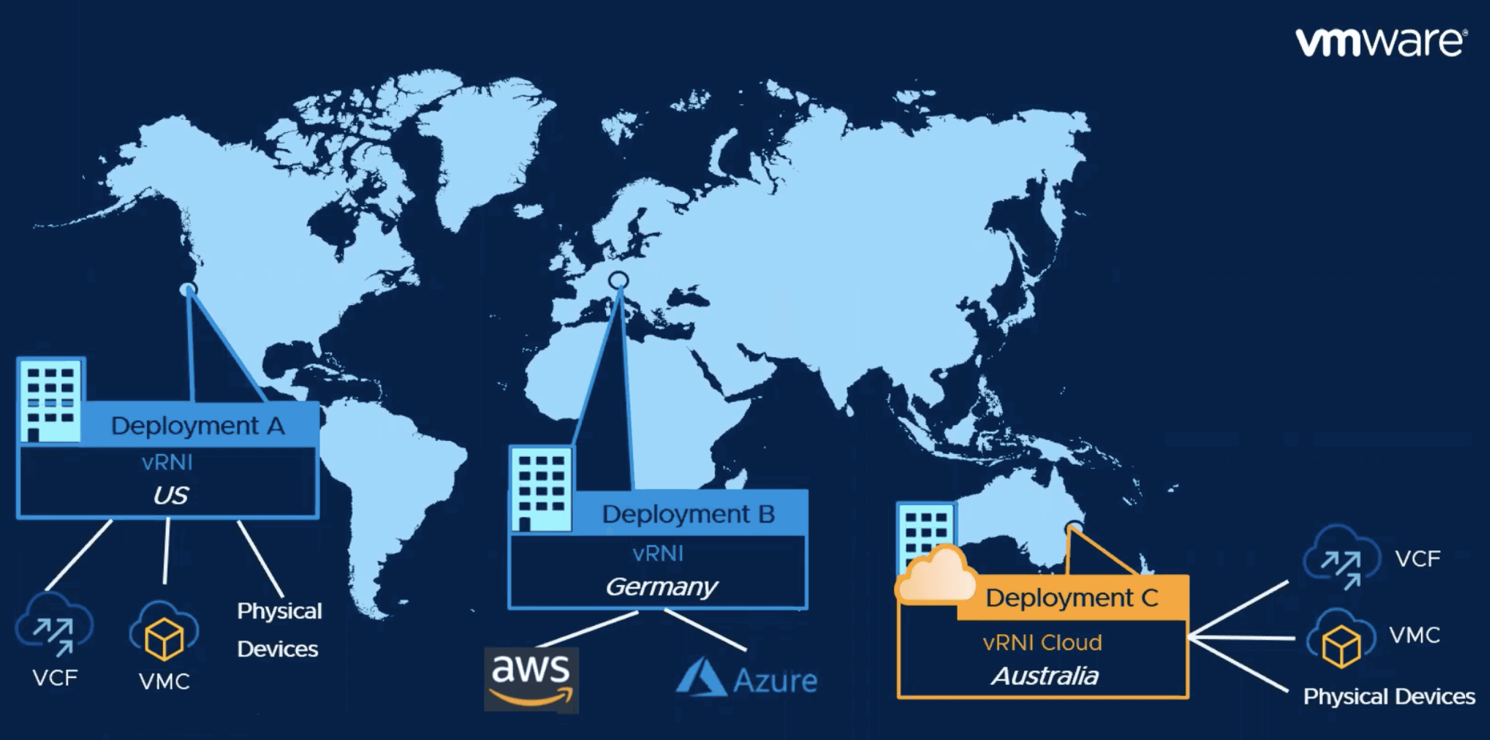
How many tabs do you need? Fifty instances across twelve countries. Each monitors several environments: vCenters, NSX deployments, AWS accounts, Azure subscriptions, physical devices and more. Each environment runs hundreds of nodes and hosts, all raising alerts, warnings and critical problems. Data flows number in the thousands. Open problems reach the hundreds of thousands.
*Everything is doing a lot of heavy lifting. You're trying to reconstruct a globe from fragments, one tab at a time. You log into the next instance. Just business as usual.
The assignment. VMware's vRealize Network Insight (vRNI) monitored and troubleshot virtual network infrastructure. Within a single instance, it worked well. But enterprises run dozens or hundreds of instances, and vRNI had no way to connect them. In 2021, VMware decided to build Federation, which links those instances into one combined view of an enterprise's network.
The design challenge.
Even with federation, how do you show it to someone? An admin opens one dashboard holding fifty instances across twelve countries. Where are they? What are they looking at? What do they do first?
This was a wayfinding problem. The data was enormous and structured differently across instances. Without clear orientation cues, a unified dashboard is just fifty tabs collapsed into one screen.
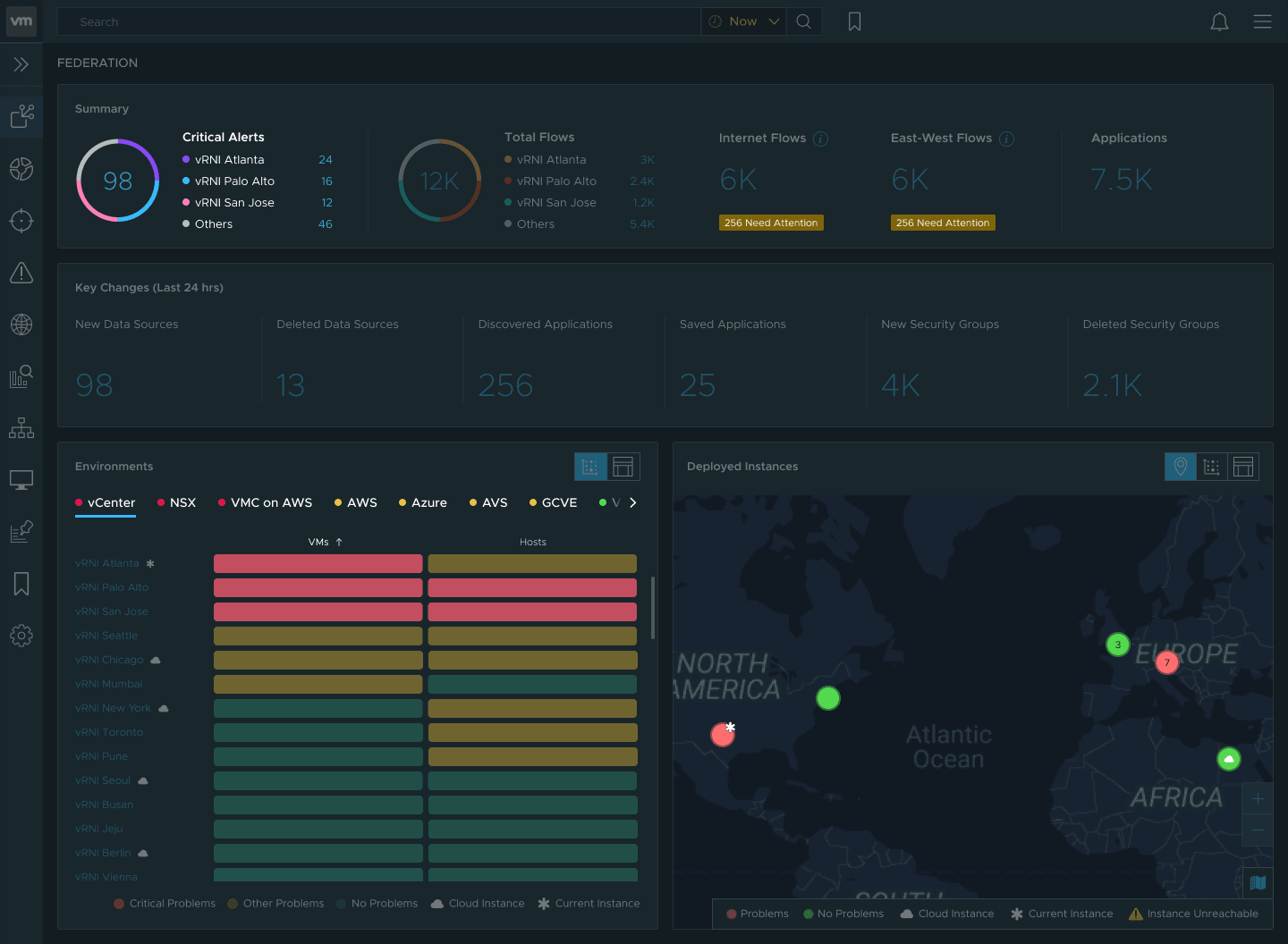
One dashboard to rule them all.
Aggregated health, alerts, and flows across hundreds of environments, thousands of applications, and every instance in an organization's network.
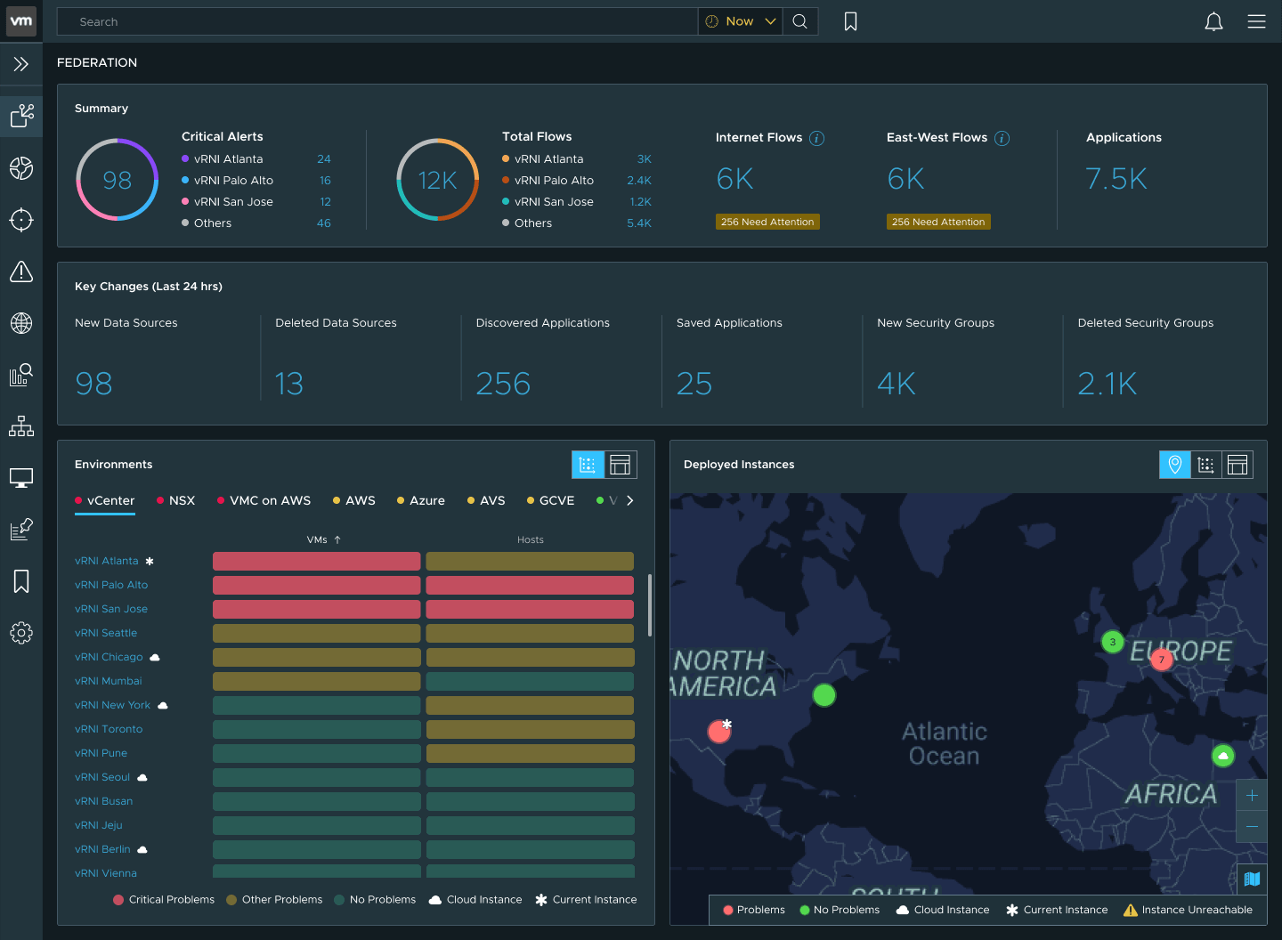
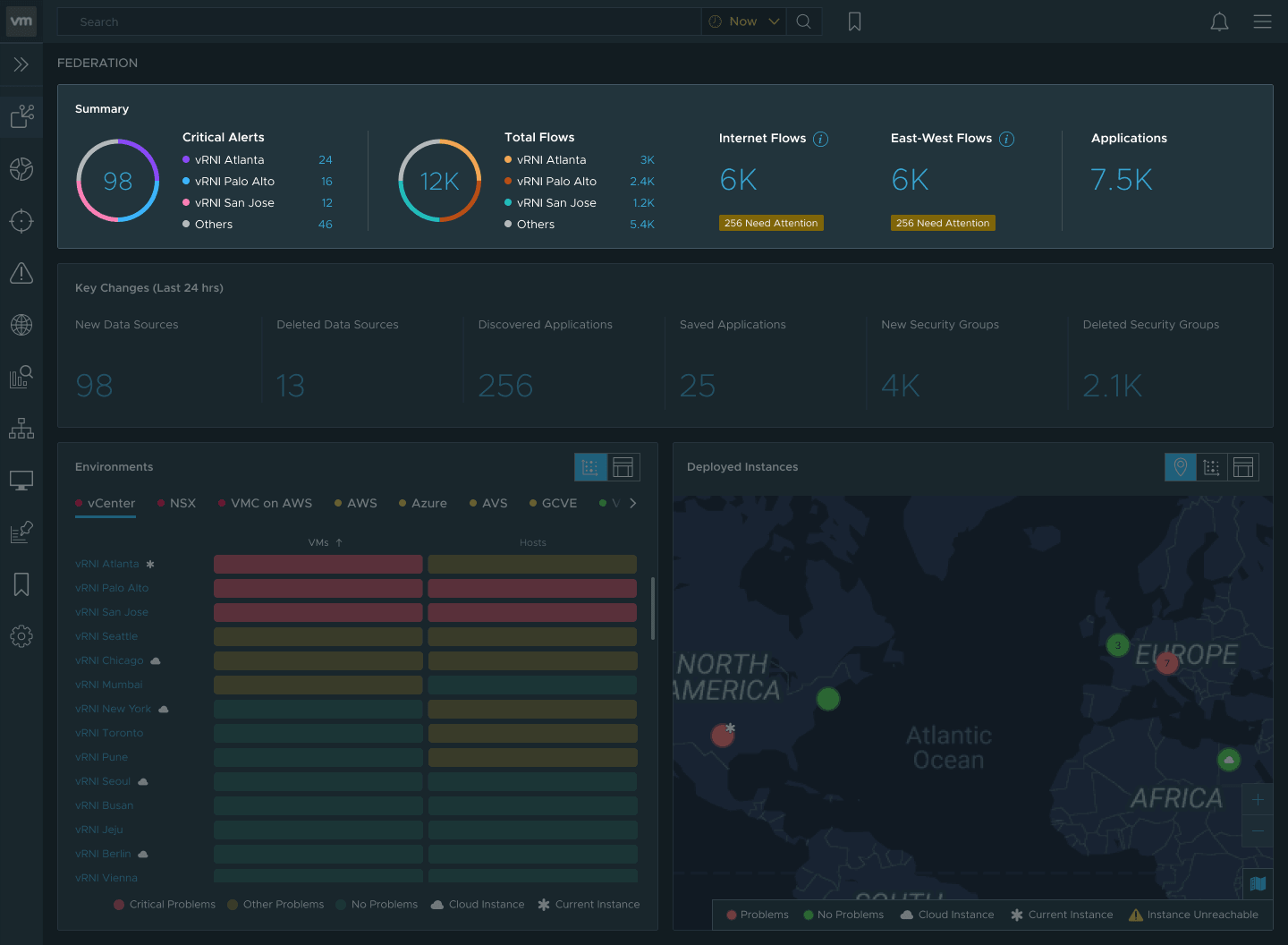
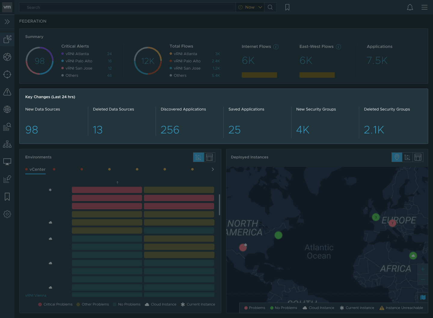
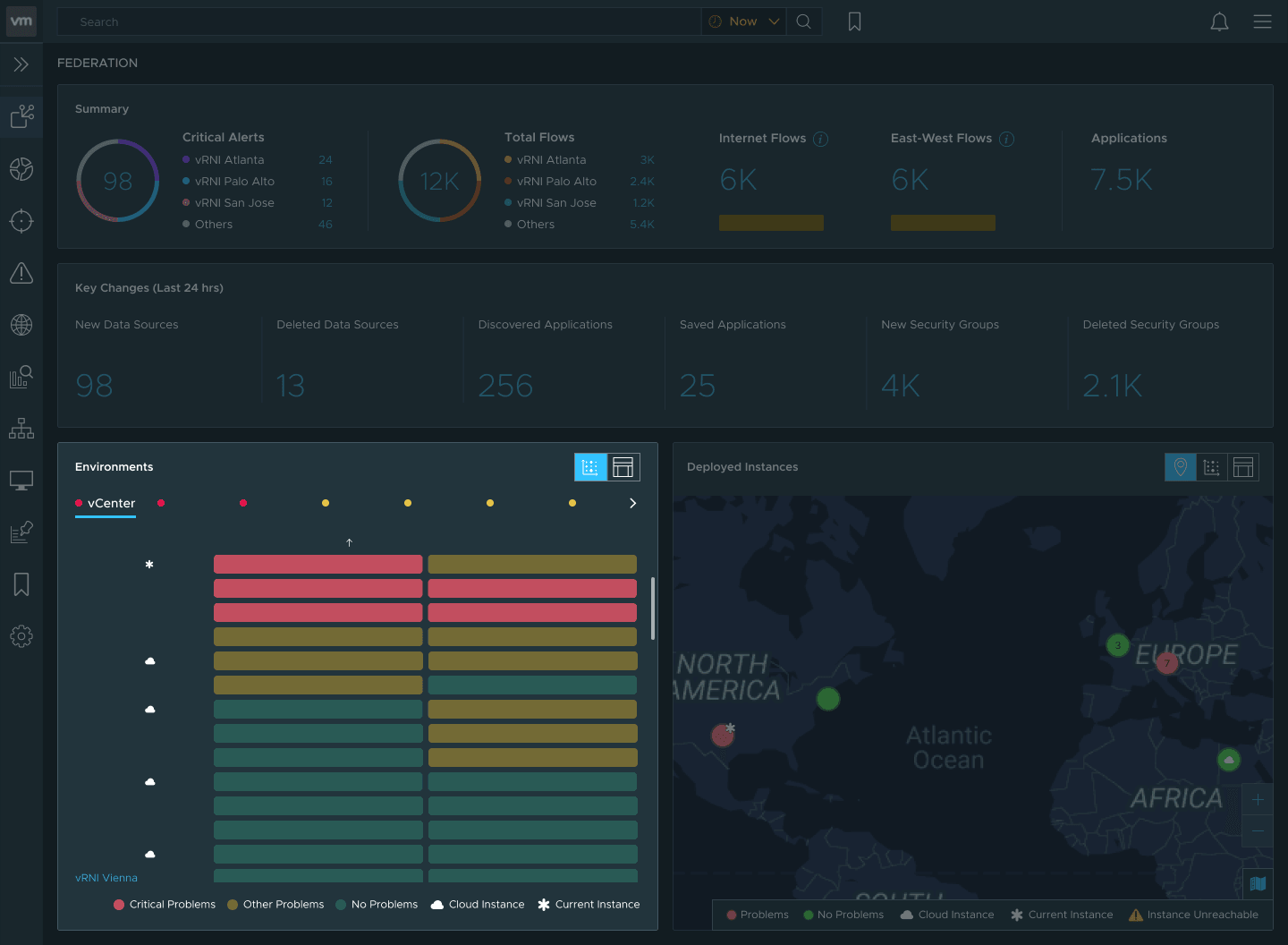
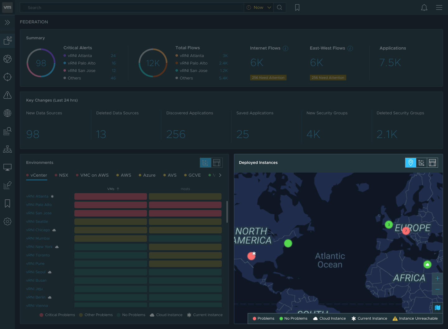
A new pattern I designed for this dashboard.
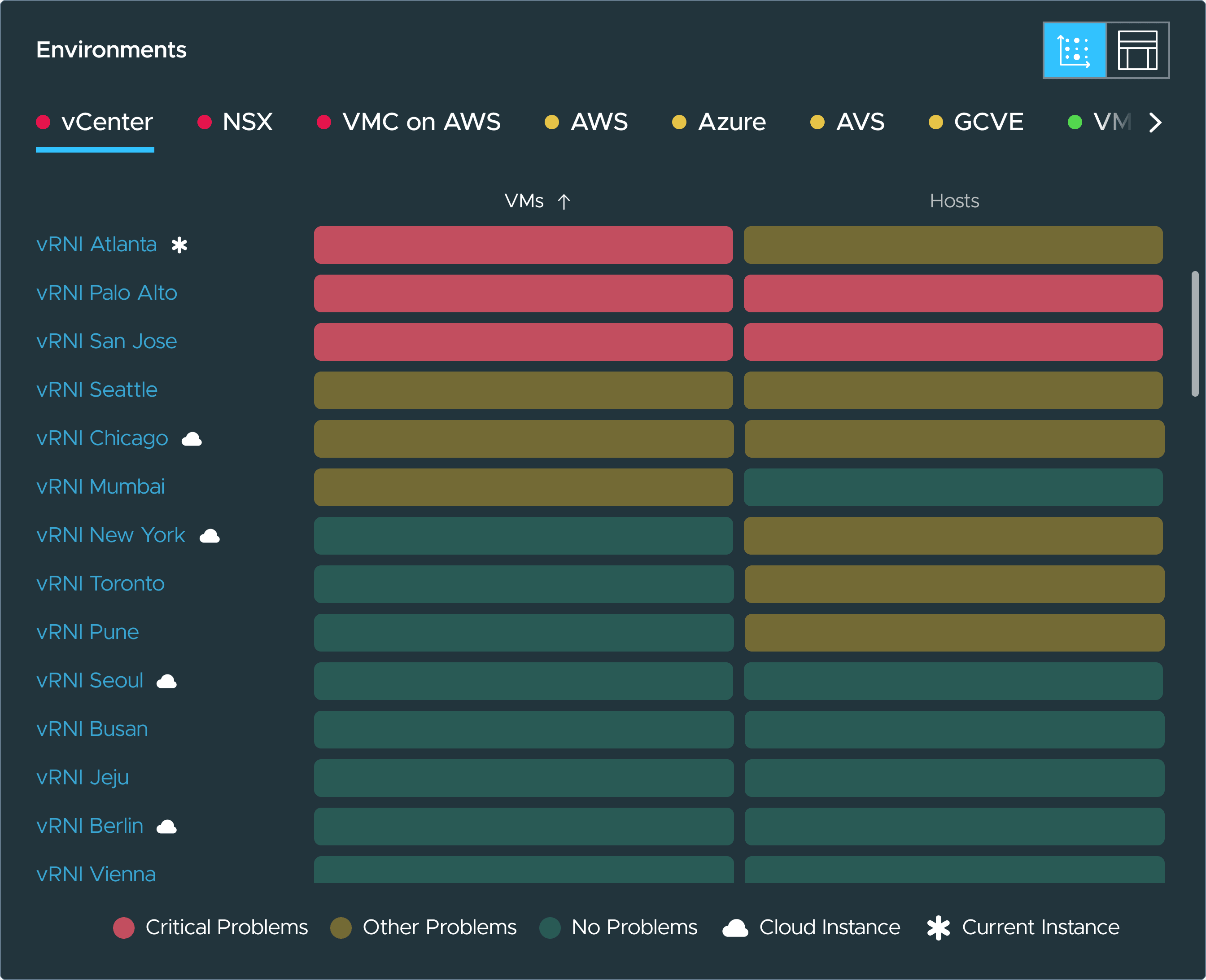
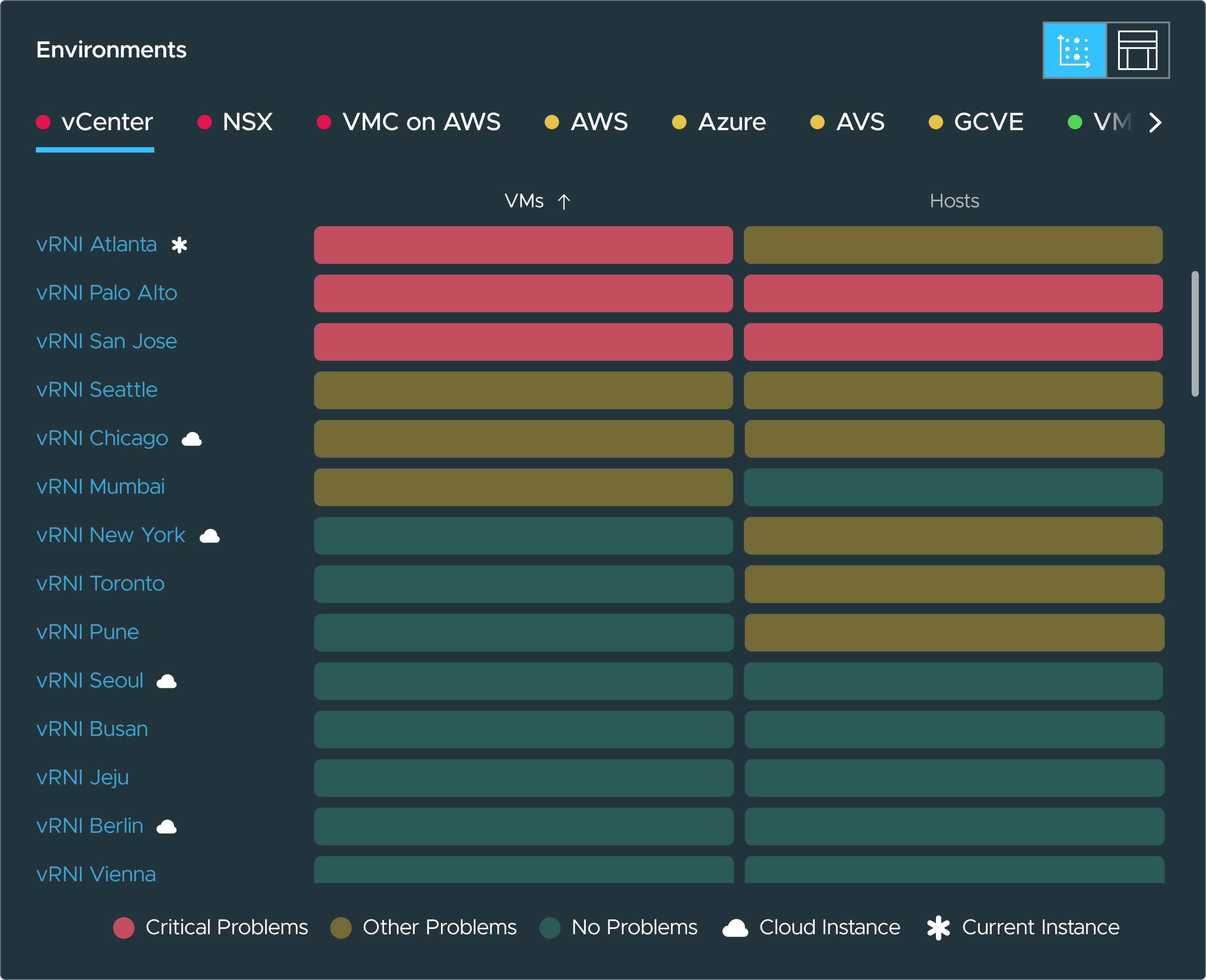 01 · Sliced by environmentYou see which kind of environment is hurting before you see which instance.02 · Worst firstWithin each environment tab, the instance with the most problems is the top row.03 · Object by objectEach column is a kind of object in the instance, VMs, hosts and the rest, each with its own health.04 · Delegate from hereA cluster of AWS problems on one instance tells the admin whose AWS admin to call.
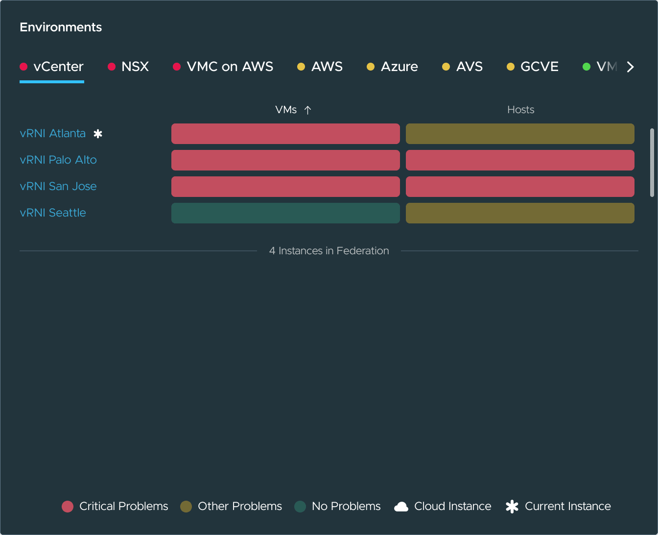
The same panels, when the data doesn't cooperate.
Designing the chaos.
The data feeding this dashboard is messy by nature. Environments structure their data differently, licensing tiers change what's visible, and feature flags change which widgets appear. Some visualizations were too expensive to compute at this scale.
Accessibility was non-negotiable from the start, and at this density the design system's defaults stopped reading. I left the system in three places.
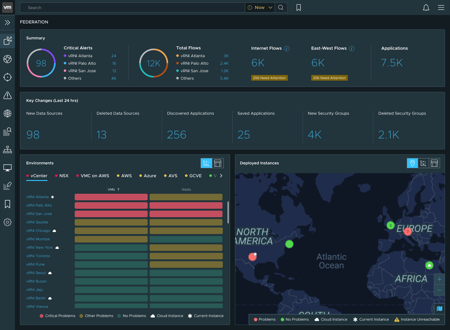
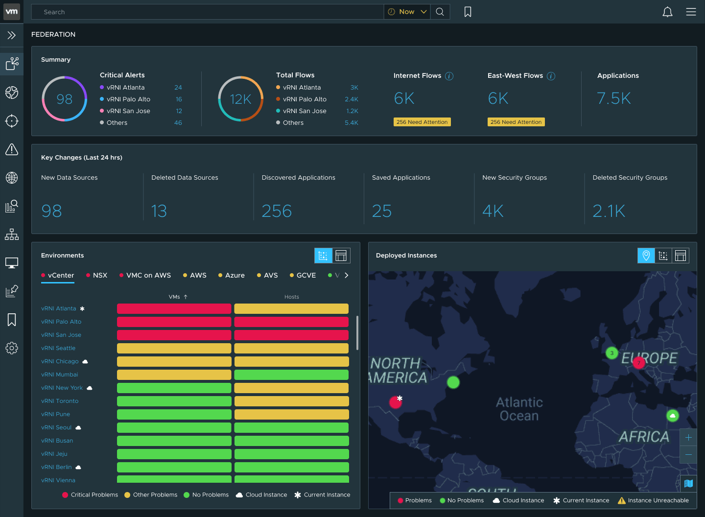
TakenA matrix palette tuned so each severity level is distinguishable at a glance.
RejectedThe standard design system colors.
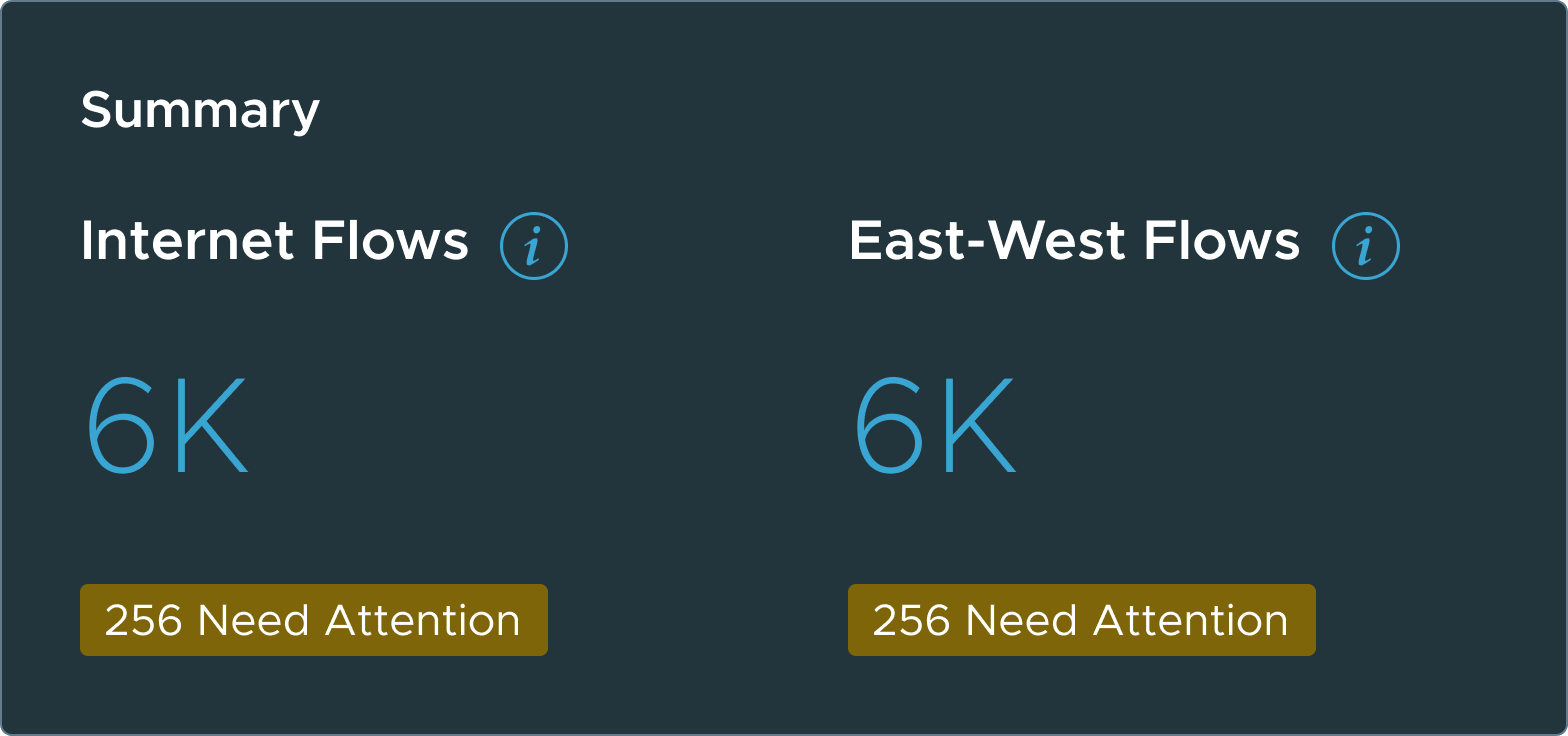
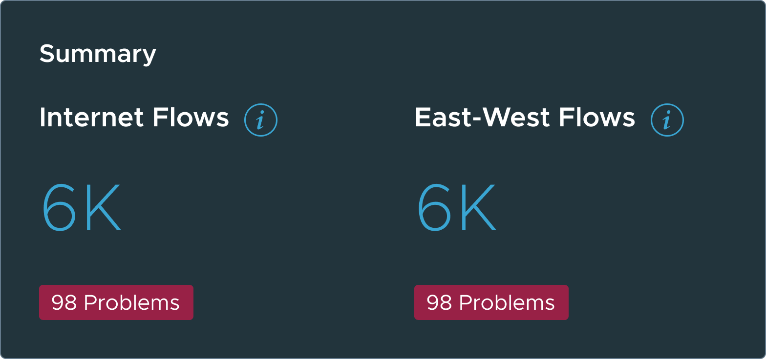
TakenYellow alert badges on flows.
RejectedRed.
 Taken
Taken Rejected
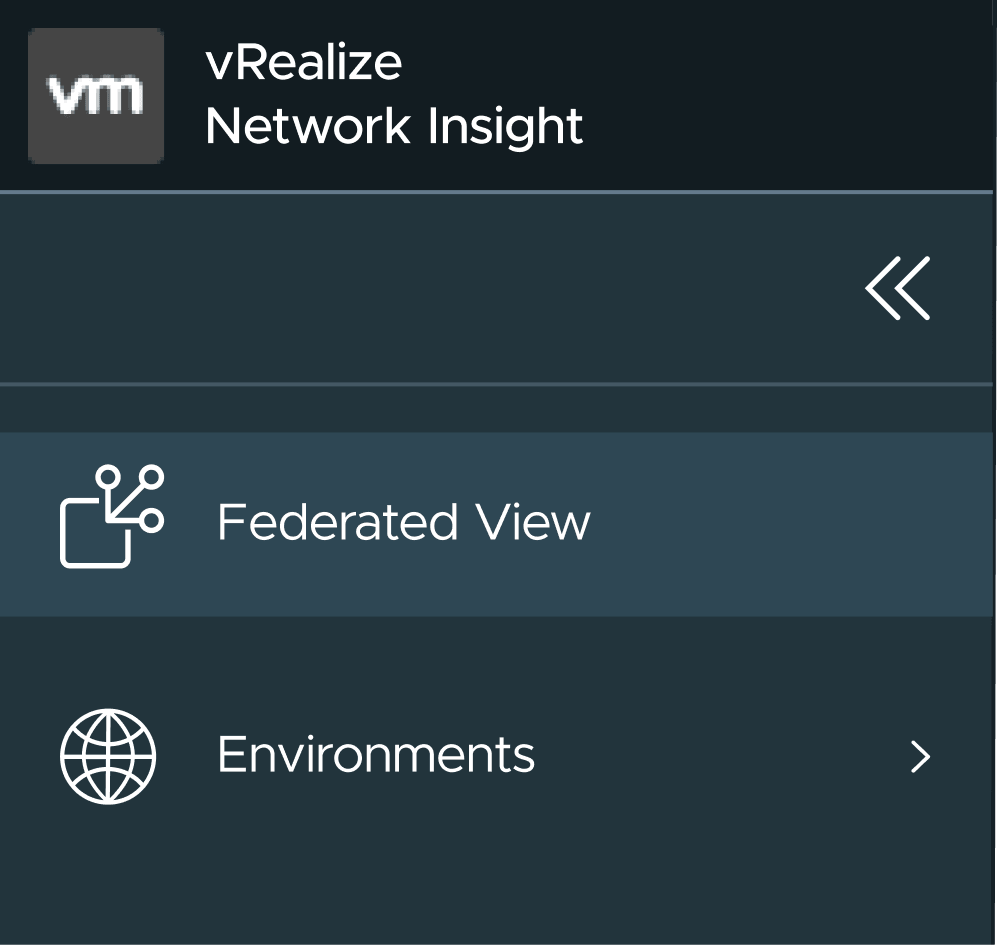
TakenA new federation icon for the product navigation.
RejectedA globe.
Both modules offer alternate views. Admins read the same data through different mental models, and the views are part of the accessibility layer: every one was built for screen readers, keyboard navigation and WCAG 2.1.
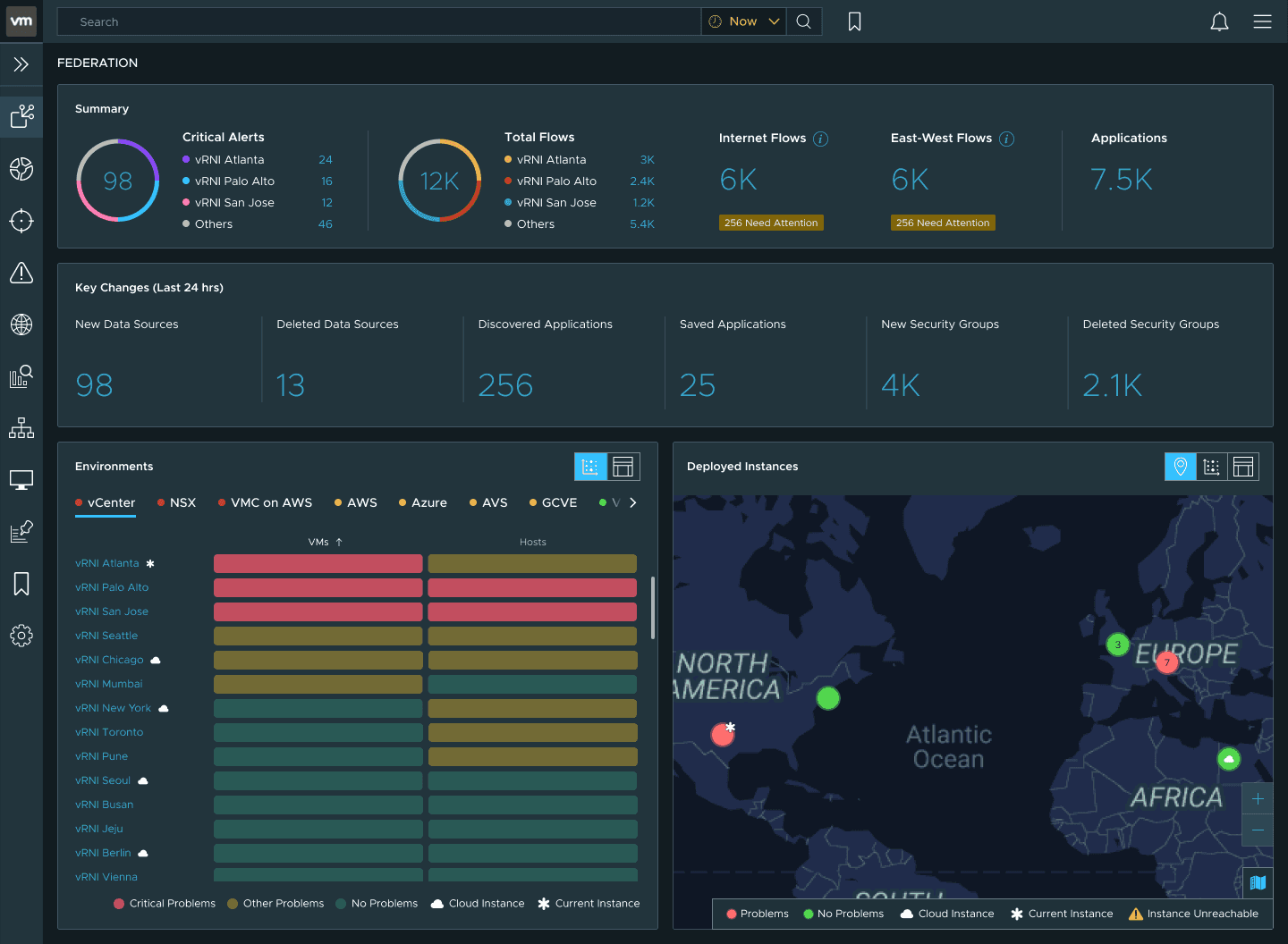
Can you get where you need to go?
The dashboard is a map, not a destination. Every interaction leads the admin closer to the specific instance where they can act. Navigation follows a consistent pattern: see a problem, get detail in context, navigate to the source.
Every instance on one map. Click a cluster to zoom in, and a pin for its health.
I designed one tooltip for every module: the same structure and interaction, with content set by context. It discloses detail on hover, so the dashboard stays clean until the admin asks for more.
- Title
- Productnameversion
- Section
- Bodycountscapacityranked liststatuschecks
- Divider
- Actionopen instance ↗view detailseach check ↗
- Carettopleftright
5 of 7 slots · body: counts · action: open instance ↗
Every blue link opens a modal with more detail. Every path ends at the right vRNI instance in a new tab, with a query pre-loaded so the admin lands where they need to be. Anything that leaves the dashboard carries a new-tab icon.
An admin hovers the 256 discovered applications. The tooltip ranks the instances that found them, and San Jose's row opens that instance.
It works from any module. A critical alert in the summary opens a modal listing instances by alert count, broken down by type: intents, problems, changes and analytics alerts. Any instance there opens the same way.
I led information architecture, interaction design, and visual design, from the PM's concept models through review and handoff.
I worked with the PM and engineering lead daily, with a design point of contact and the design director twice a week, and with IC engineers and QA during build.
Looking back
The product was mature: entrenched legacy patterns, a rigid component system and a release every six months. New patterns had to respect the learning curves existing users had already built.
I deviated most from the design system, the thing I was hired to respect. The matrix palette and the yellow badges were both arguments with its owners, and both came down to one point: consistency is a means to legibility, and at this scale the two pulled apart.
When every combination of licensing, feature flags and data structure is a valid state, the UI can't assume anything. It has to hold up in states nobody designed for. You never see one ideal screen. You design a system of defaults and hope the composition holds.
I couldn't test whether it held. The dashboard shipped once, and I was gone before the next release. Compute limits kept some of the visualizations I wanted most at the concept stage. I'd want telemetry on what admins clicked first, and I'd want it early.
Interview excerptRemarkable skills in designing complex enterprise products and creating elegant solutions that balance form and function perfectly.
Responses from customers using VMware's network visibility suite, the product the federated view shipped into.
We're seeing incredible visibility into our virtual infrastructure, something we didn't have before.
We are making VMware vRealize Network Insight Cloud IHS Markit's standard tool for application, network and security visibility and troubleshooting.
vRealize Network Insight helped us learn more about our applications and how to move them.