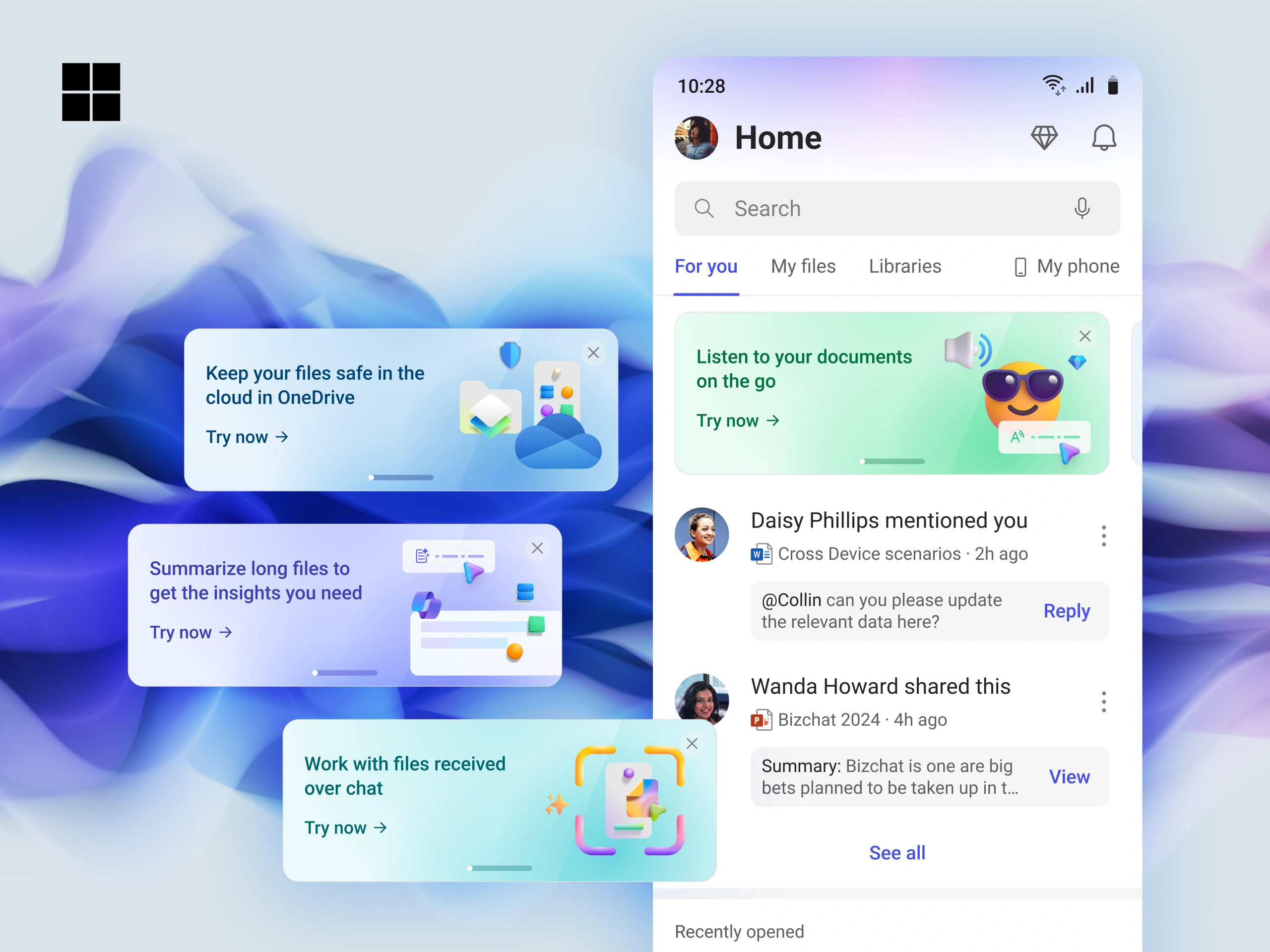
M365 Mobile still read as "Office on a phone," so features like Microsoft Designer went unnoticed. Every discovery pattern we tried either interrupted people or wouldn't scale. I built a promo card framework that made new features feel like part of the app.
This is a container div
This page wraps a Figma file. Scroll down for the full case study in its natural habitat, interactions included, plus details I probably didn't need to add.
The framework
A pretty card is irrelevant if it doesn't change behavior. In the pilot and the rollout, the cards turned curiosity into launches and repeat use.
I owned the design and initial strategy end to end, with one engineering lead and three engineers. The PM joined later to turn it into a PRD.
Looking back
Discovery only works when it feels earned. The best growth surfaces avoid looking like marketing and feel like part of the product.
Interview excerptOne of the rare Designers I have seen who partakes in all steps of the execution … to finally testing the feature, filing bugs and following up with fixes.
Interview excerptYour eye-to-detail for UX nitty gritties and constant feedback on user flows has helped the product be in better quality.