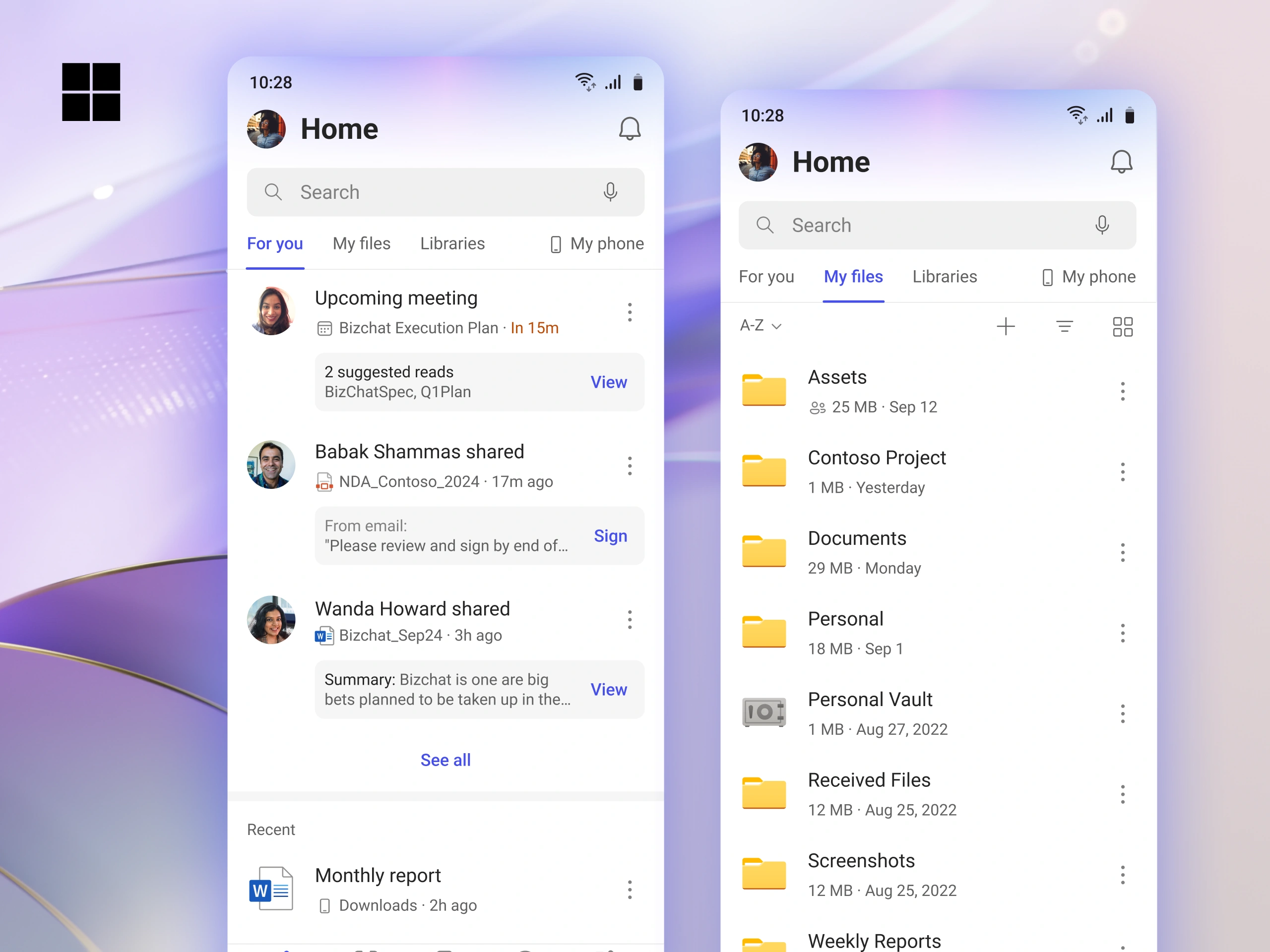
Fewer than one in five of M365 Mobile's 128M monthly users opened it on a given day. The home page showed files you'd already opened: useful once a month, forgettable otherwise. We redesigned it around what you need next, and four million more people started opening the app every day.
128 million people. That's how many people used M365 Mobile every month. Only 24 million opened it daily.
One of them had never opened the app on purpose. It came preinstalled on their Samsung, and they used it to view PDFs. Technically "active", with zero intent.
Newspaper, not a magazine.
A magazine gets opened once a month. A newspaper gets opened every morning. M365 Mobile was a magazine, and Microsoft leadership wanted a newspaper.
The home page was the face of the app. If it didn't give you a reason to come back tomorrow, nothing else mattered.
Where it all began.
Office Mobile, as it was first called, launched in 2020 as one view of your Word, Excel and PowerPoint files. Then it kept growing.
It got PDFs.
It got scanned documents.
It got Forms.
It got videos.
It got voice notes.
It got notes.
It got Designer.
It got To Do.
It got Loop.









Attempts (to organize) were made. Before this project (and my involvement), there were various attempts to fix this mess.
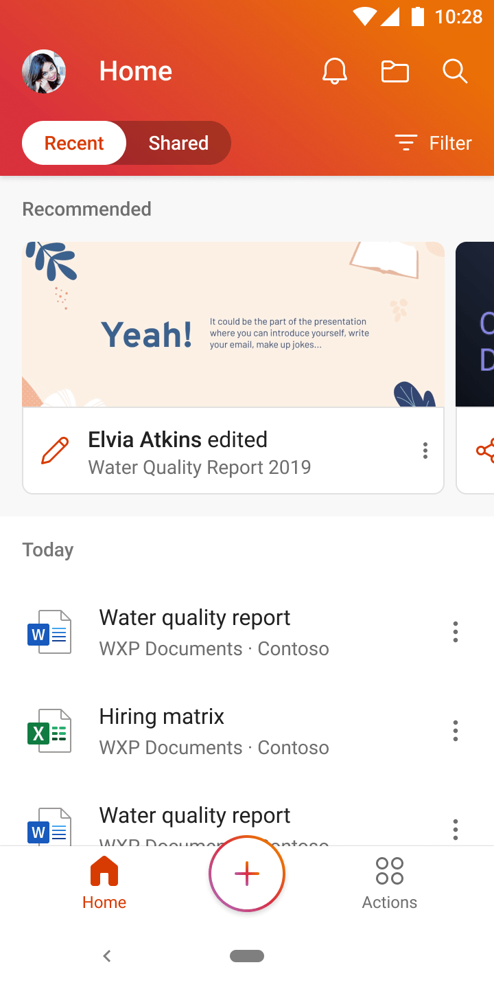
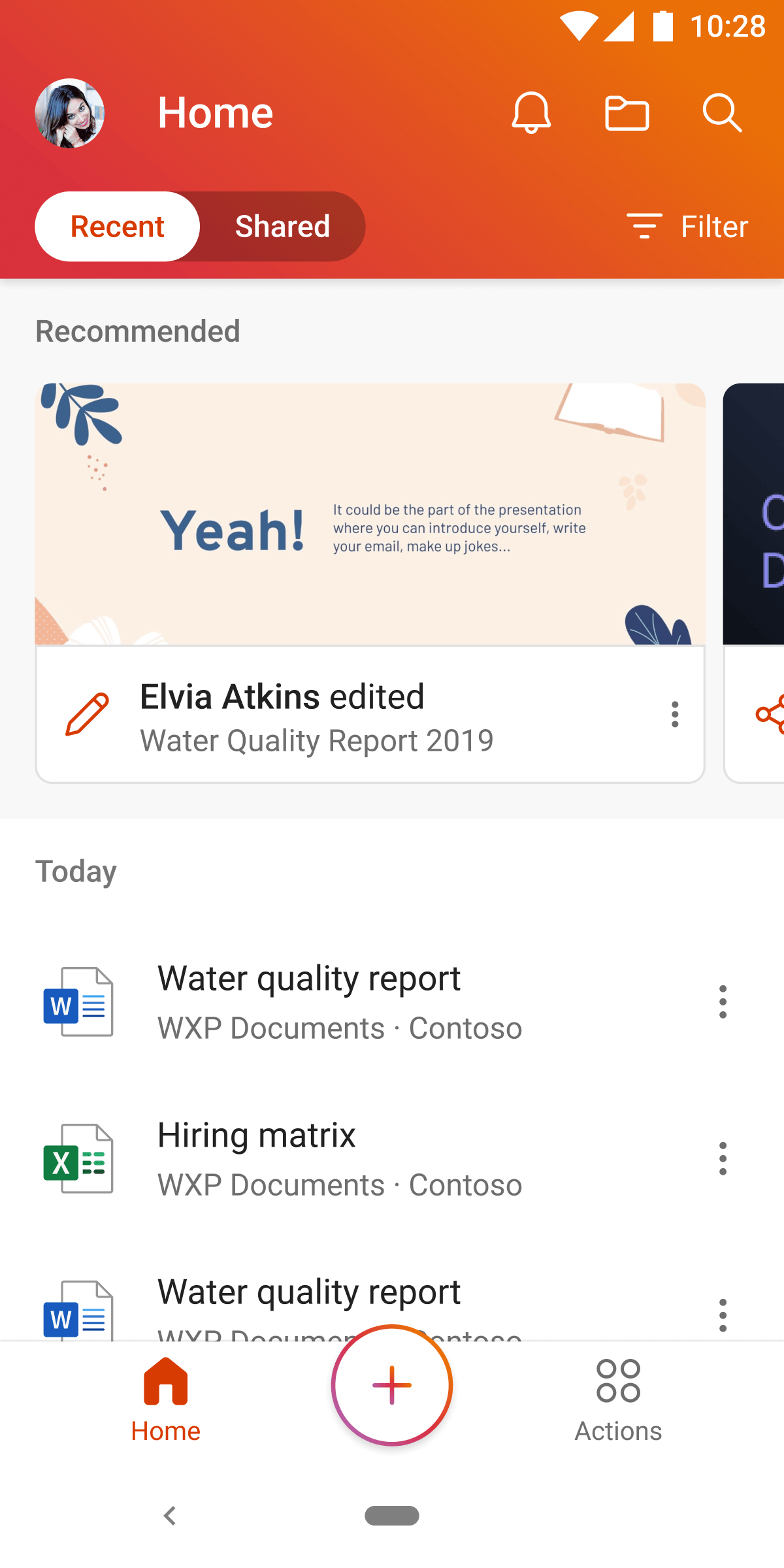
First: a toggle between "recent" and "shared" along with the "recommended" section.
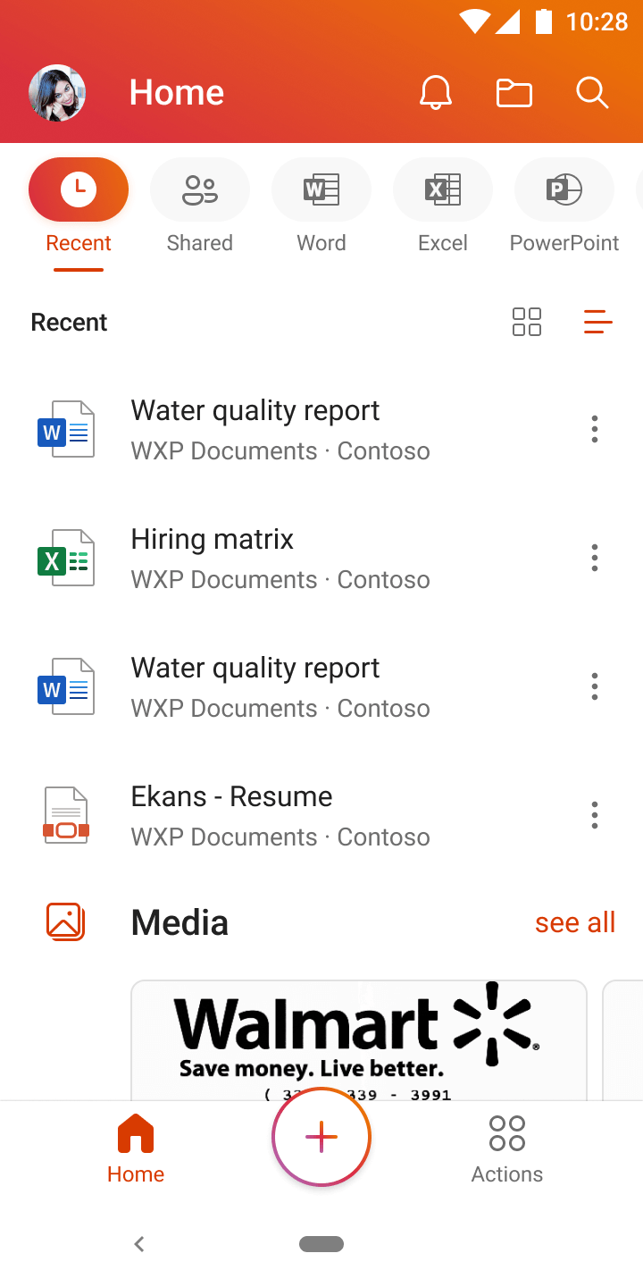
Then the Quick Action Bar (QAB), a customizable row of tabs, tried to categorize and filter your list.
Neither scaled. Each buckled under the next content type the app added.
Users never configured the slots or picked their own tabs. They parked on the default and stayed there.
Content relevance was the real problem.
The default view, "recently opened", was the hidden cause, especially in the new card view.
If you'd just had a document open on your laptop, it was the first thing on your phone. You already knew what was in it.
The content model was wrong. No UI on top was going to fix that.
What people actually needed.
We talked to users. Their intent ran from right now to just looking.
| Intent | Question | Who | Answer |
|---|---|---|---|
| Urgent | What needs my attention right now? |  Kayo Miwabusy PM Kayo Miwabusy PM | For You, Stay on top |
| Specific | Why can't I just get to my file? |  David Powergrumpy manager David Powergrumpy manager | My Files |
| What was that file called again? |  Aadi Kapoorlost intern Aadi Kapoorlost intern | DeprioritizedWhySearch was owned by another team with a years-long roadmap. We needed to ship in months. | |
| Ambient | What files are my coworkers looking at? |  Cecil Folknosy coworker Cecil Folknosy coworker | For You, Trending |
| Wait, the app does that? |  Amanda Bradyold school leader Amanda Bradyold school leader | Promo cards This one became its own case study. |
And we rebuilt the home page.
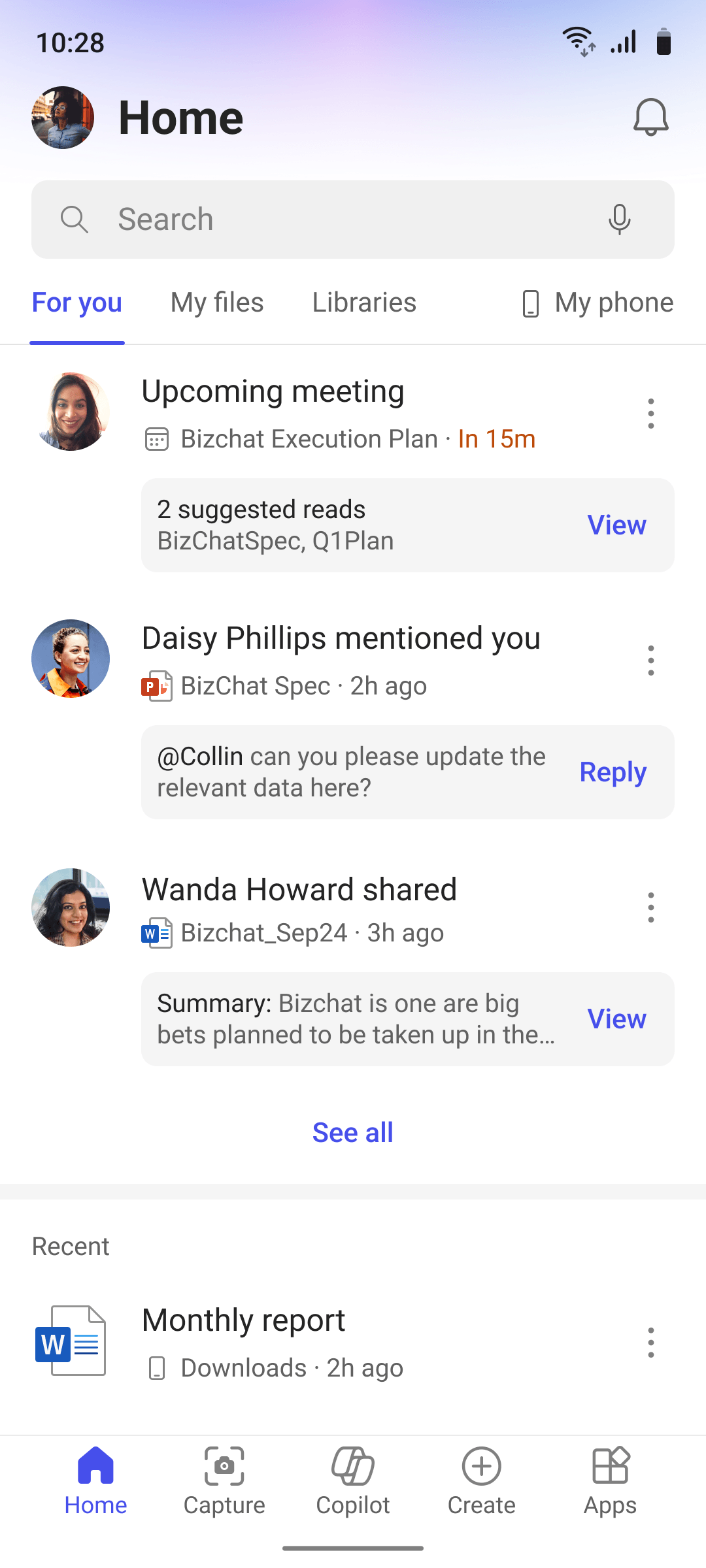
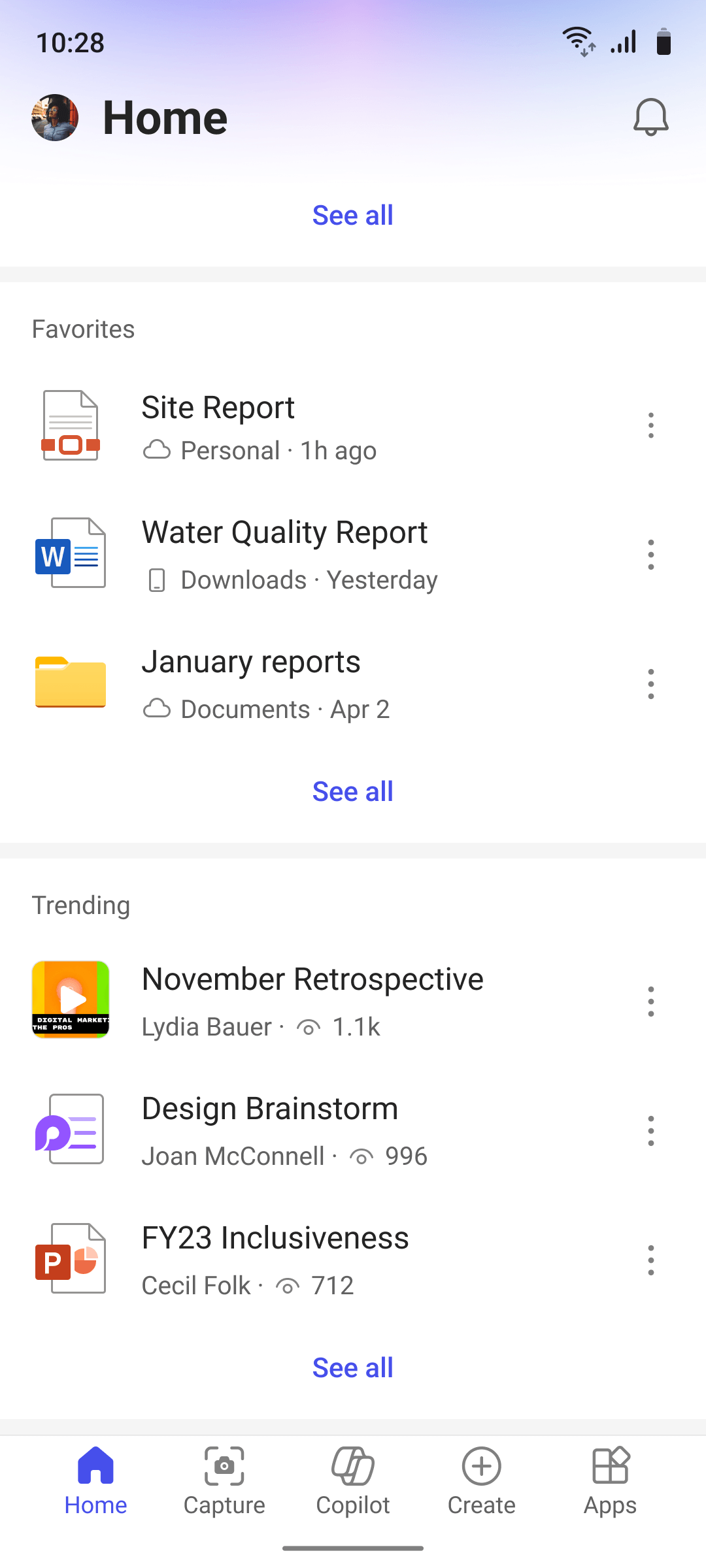
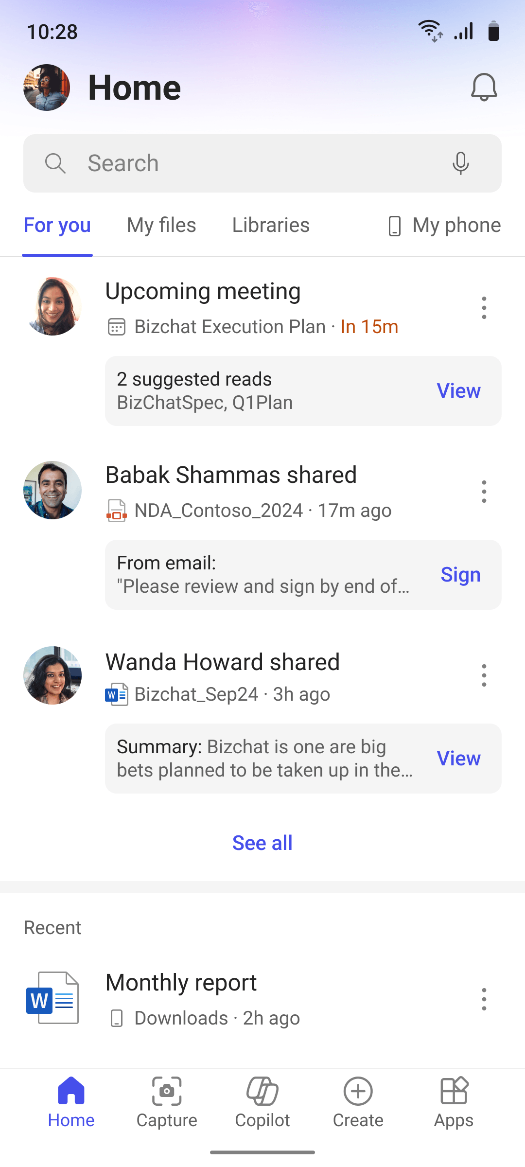
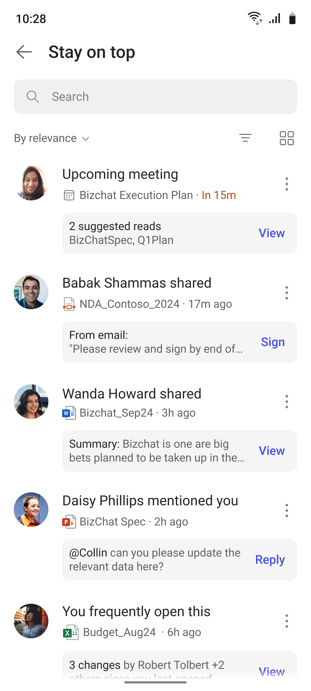
The app triages for you. What needs you now sits at the top, in "Stay on top". Below it: recently opened, favorites and what's trending in your organization. What you need comes before what you touched last.
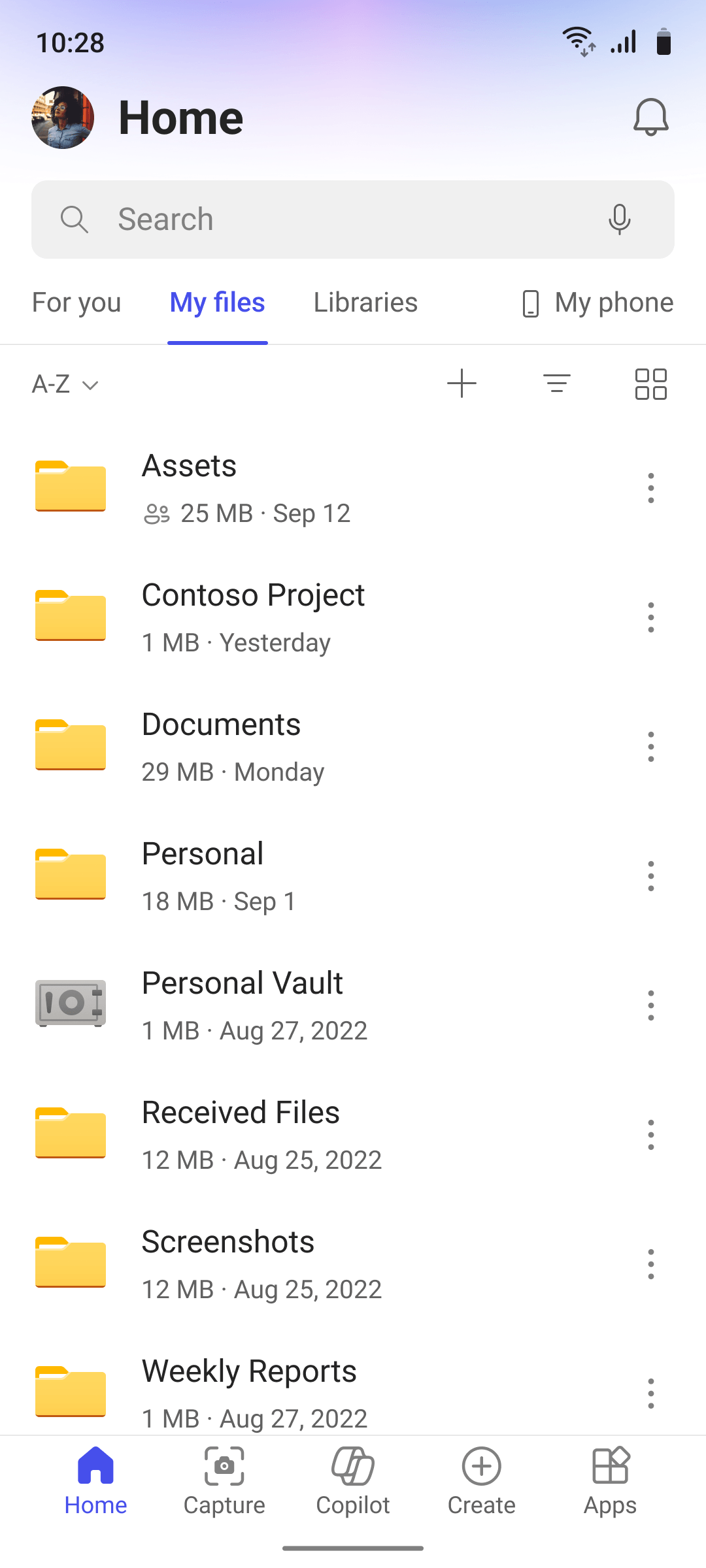
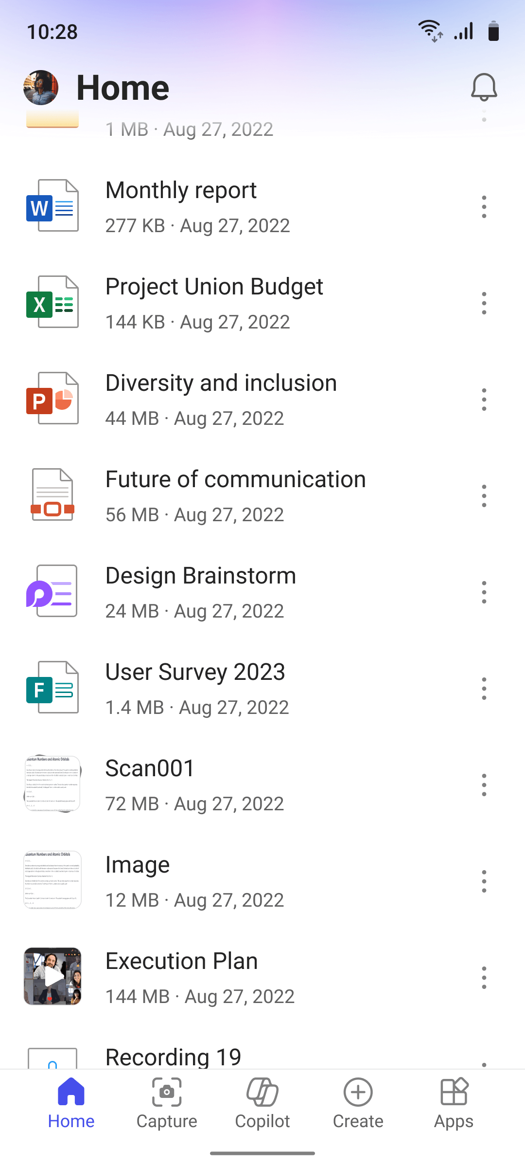
Your whole OneDrive, in the same folders as on desktop. Before it, the app didn't let you browse your own storage. It answers "I know where it is, just let me get there."
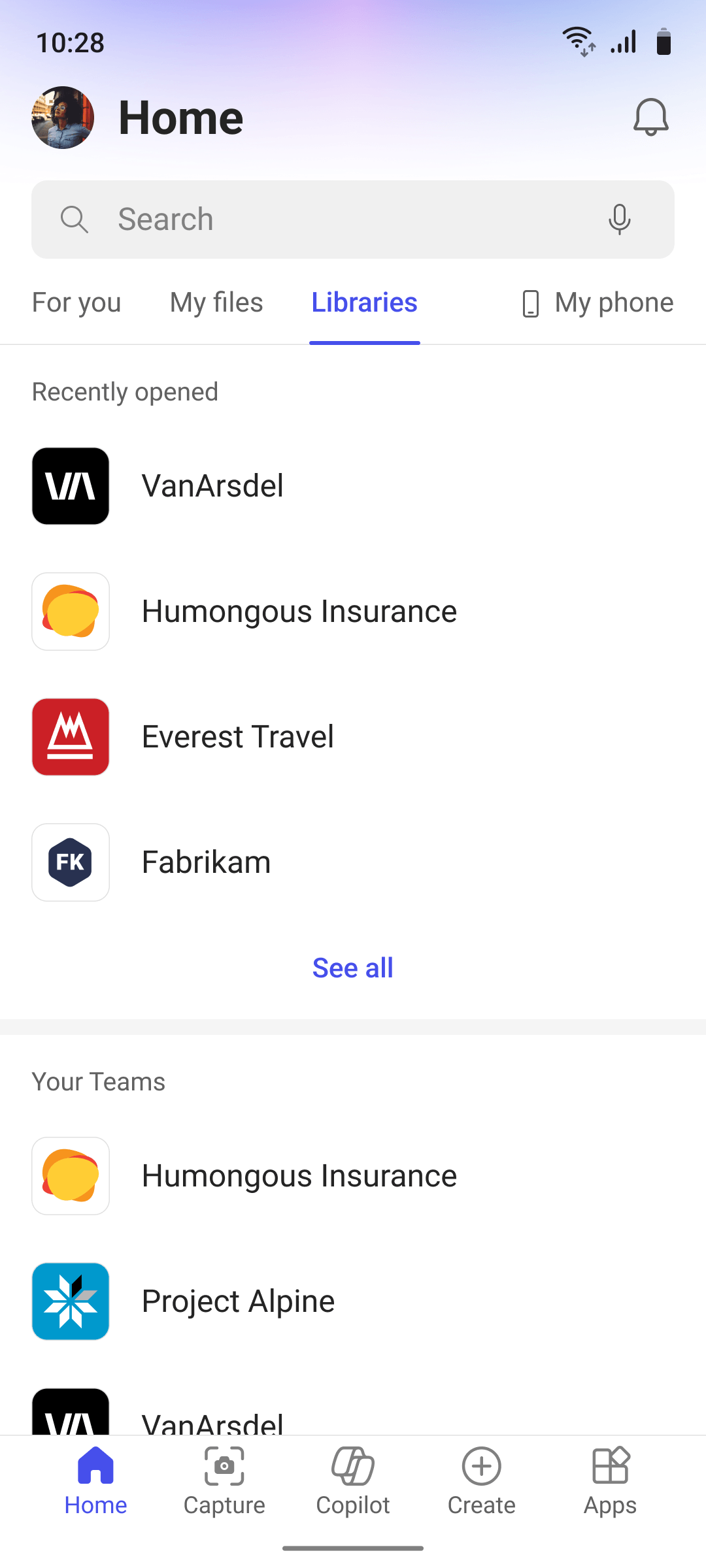
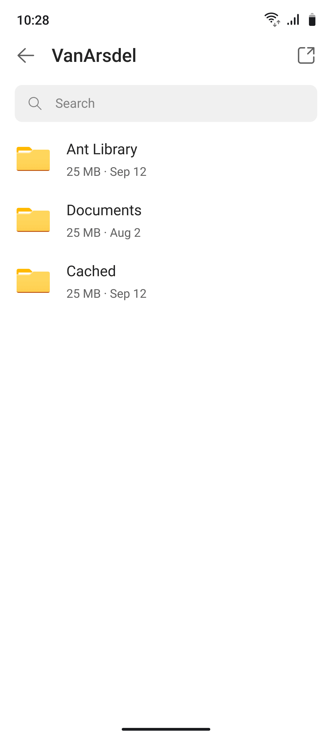
SharePoint had the same gap. This tab lists every library you can access, for people who work across team sites.
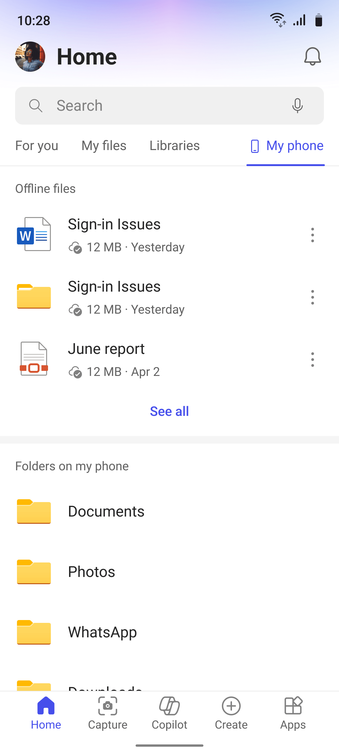
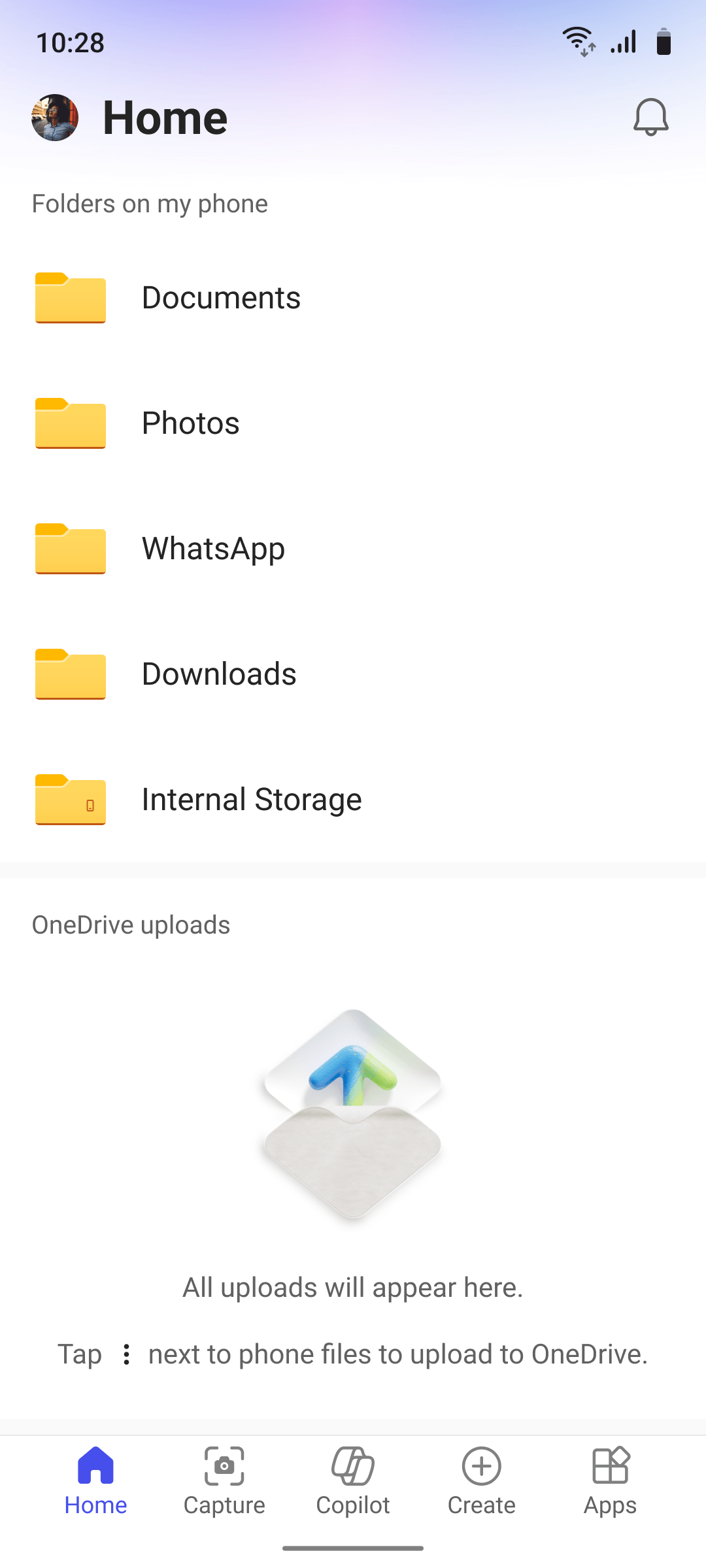
Offline files, files on the device and uploads in progress used to be buried. My Phone gives them one place.
Every page opens as a list, easy to scan. Switch to cards to spot a file by how it looks. Sort, filter and view work the same on every page.
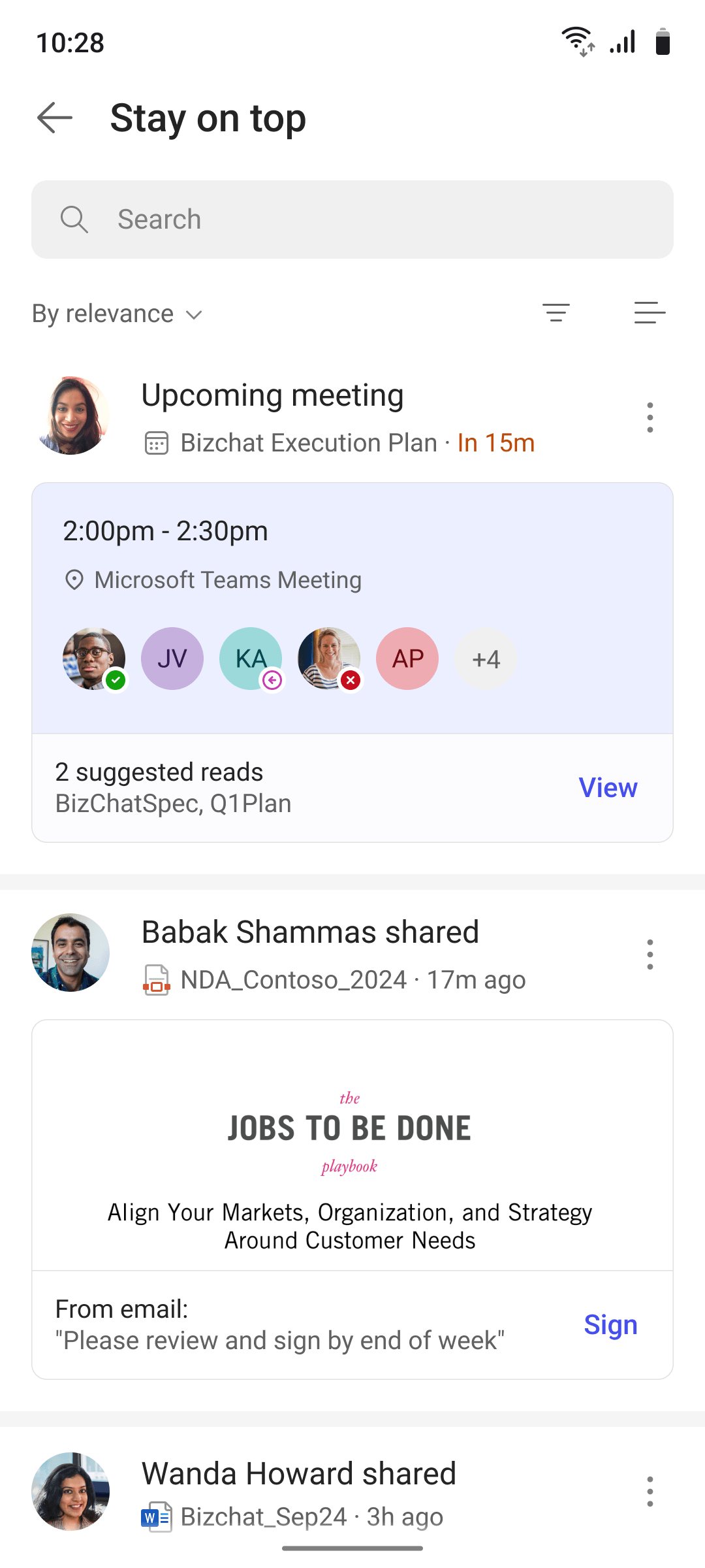
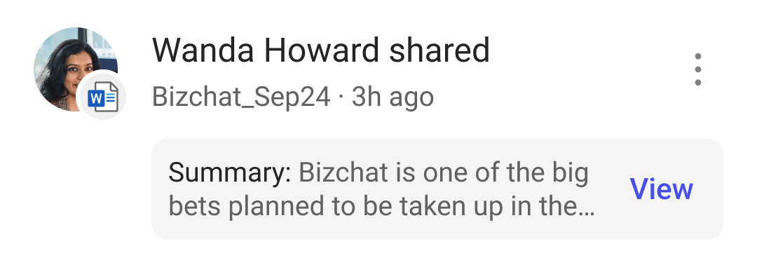
The same file shows up in seven states across the app. Each shows different details, because context changes what you need to know.






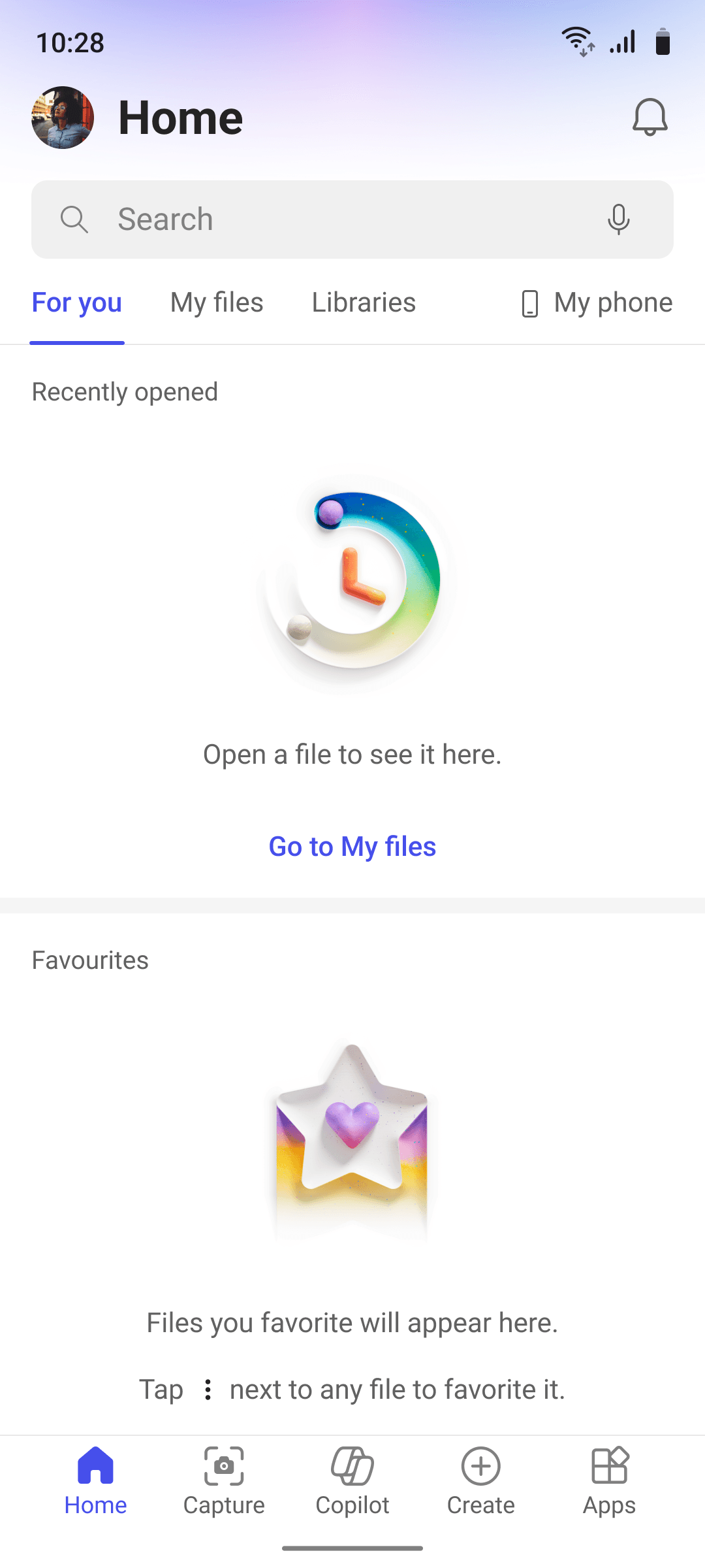
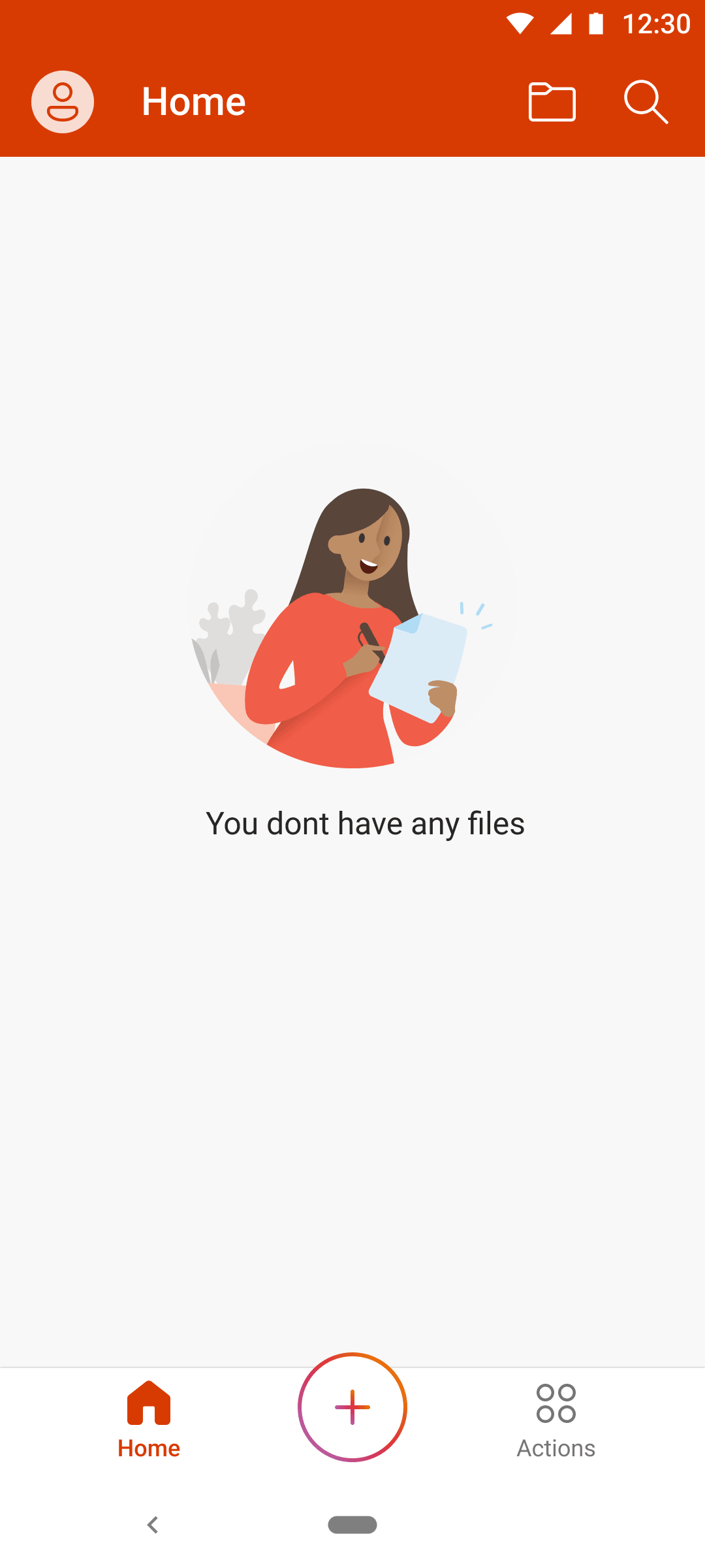
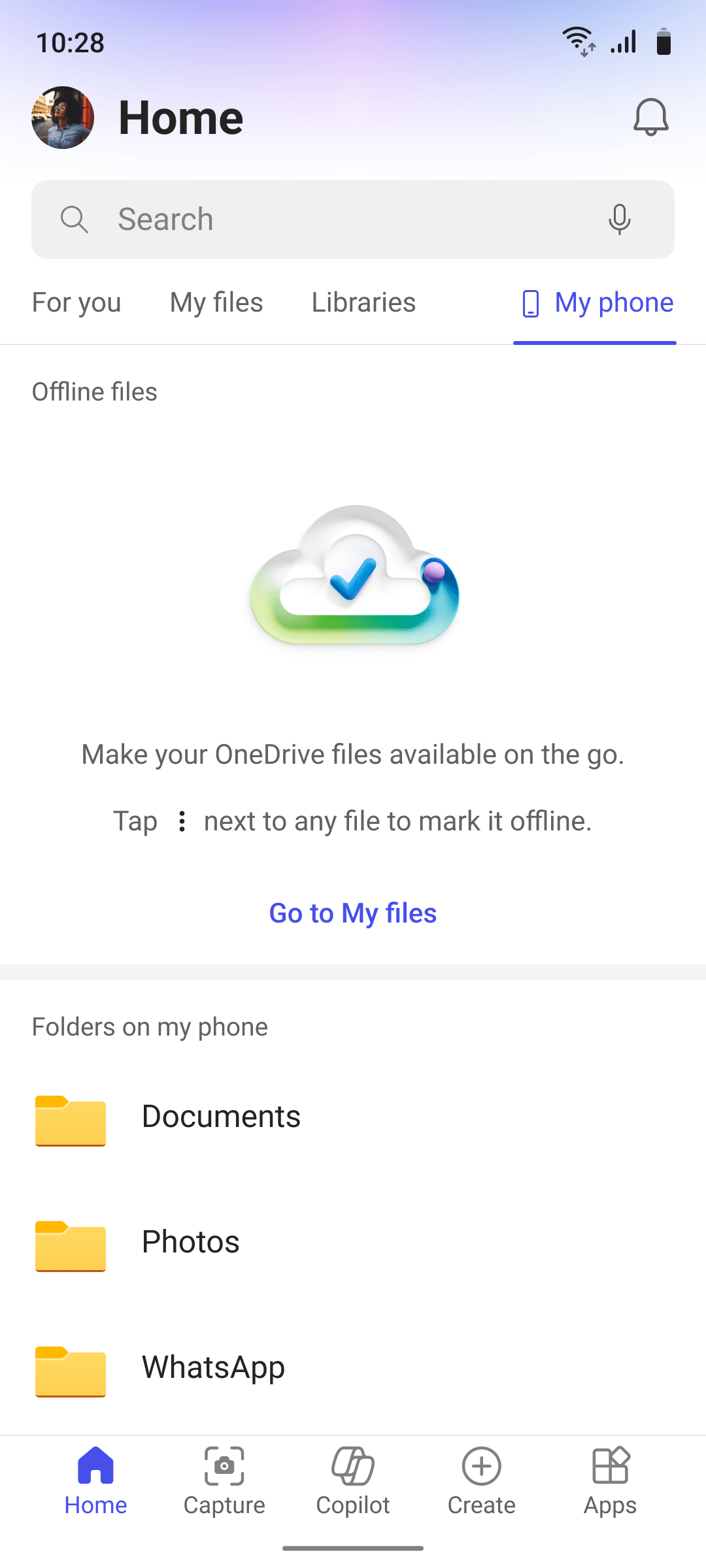
Empty states used to be blank screens. I made them starting points that answer one question: what do I do here? No files? Here's how to open one. No offline saves? Here's why you'd want them.
Redefining "relevant".
The old "recommended" section showed almost any signal it could capture, which felt impersonal and often annoying. Working with PMs over several months, I defined which Microsoft Graph signals actually meant "you should look at this."
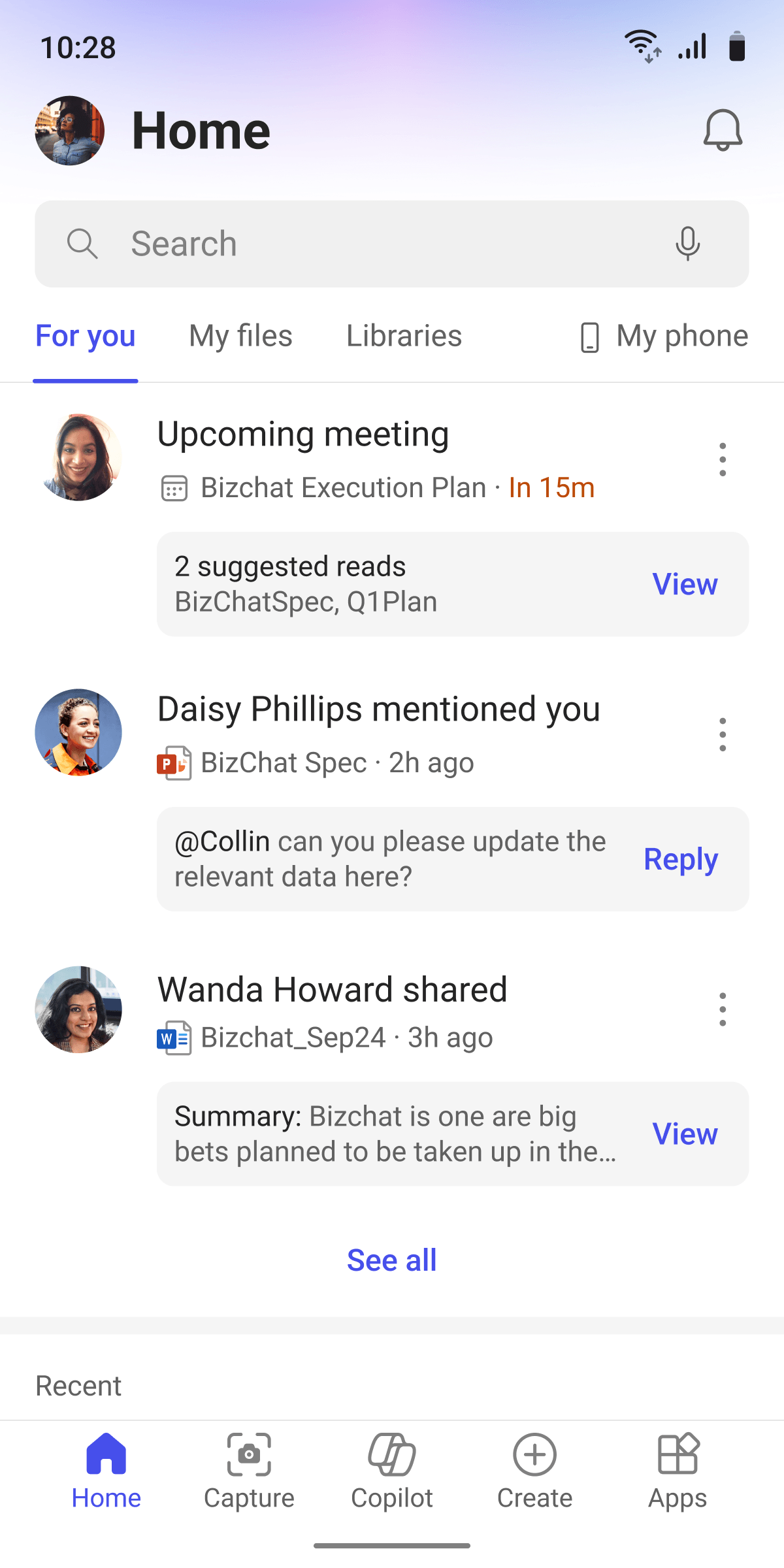
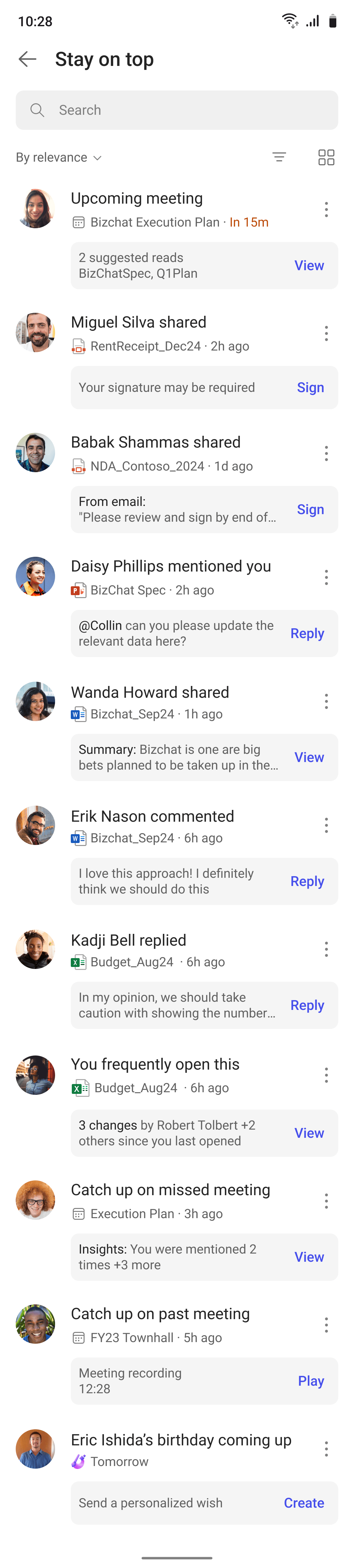
TakenRank the feed by how soon inaction has a consequence.
RejectedRank by signal category.
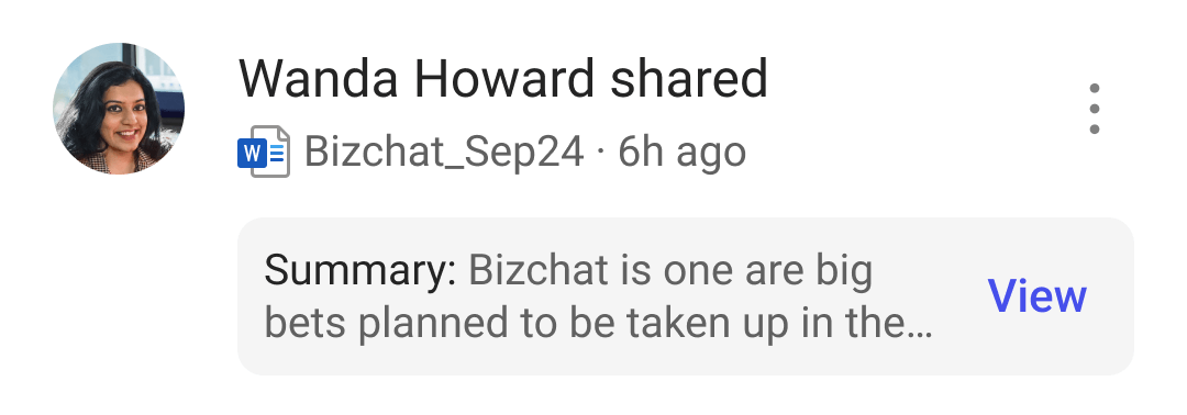
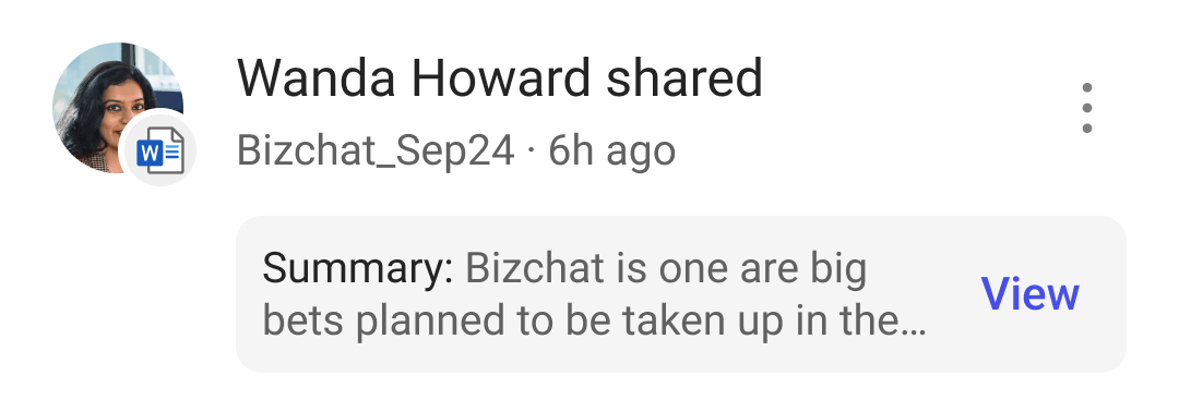
TakenInline, beside the file name.
RejectedBadged on the person.
Fluent, but not fluent enough.
The inline icon was one divergence among many. Across the app we drifted from Fluent: the header's gradient, the tabs, icon norms, gutters and spacing, list rows with optional parts.
I built the system to stay close to Fluent's look and feel, and to go past it where we needed flexible components and new patterns.
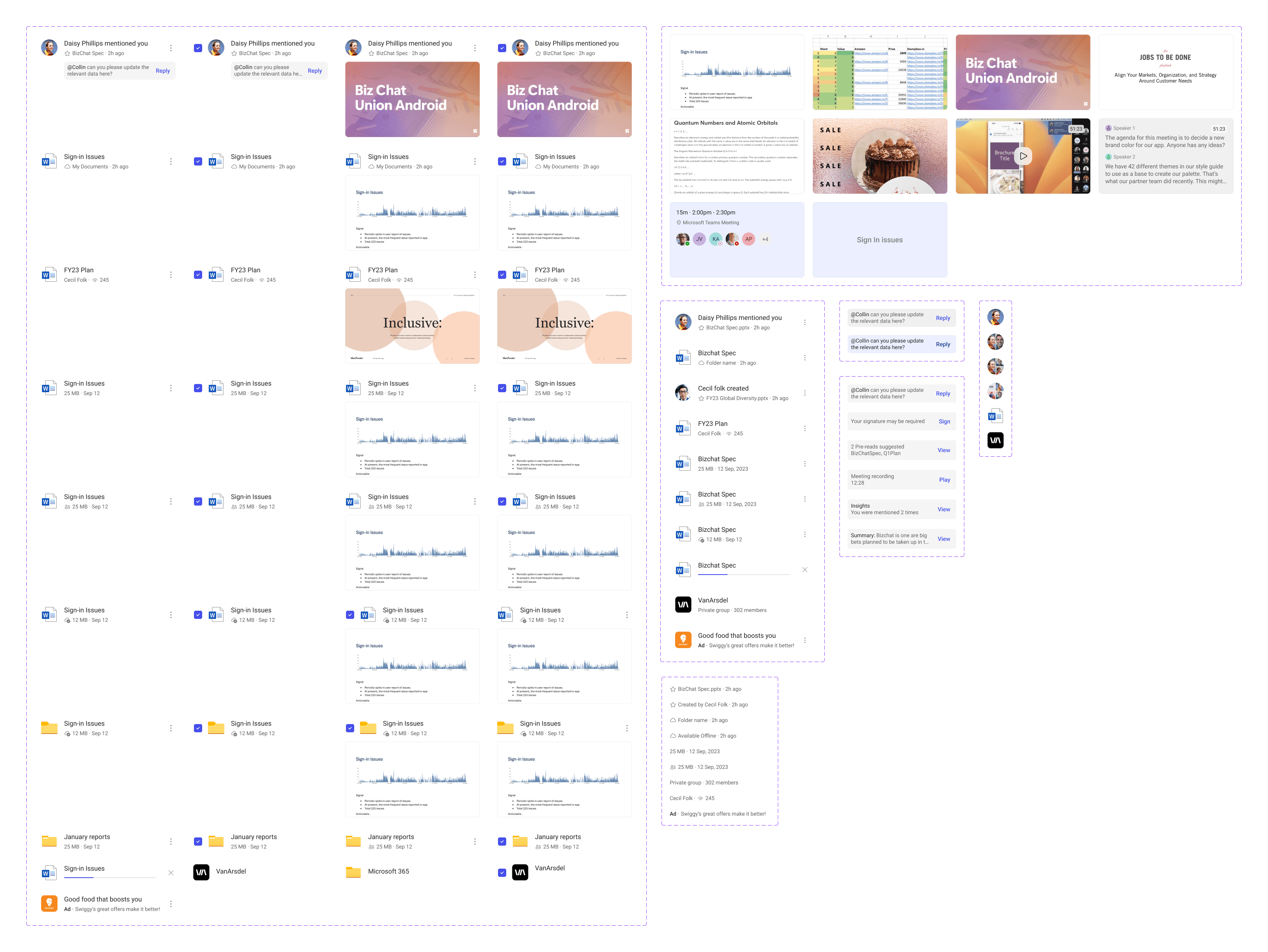
If this looks like Fluent, good. We borrowed atoms and gave the row a lot of new tricks: the layouts and controls the product kept asking for.
TakenBuilt our own design system, shipped it, and aligned after.
RejectedWait for Fluent.
128M people and the forgotten ones. Accessibility was non-negotiable. Nothing entered flight until it held up at 150% font, with a keyboard and through a screen reader.
It was built for more than English, too: copy shaped with localization experts, layouts tested on longer scripts, and tuning for low-end devices on slow networks.
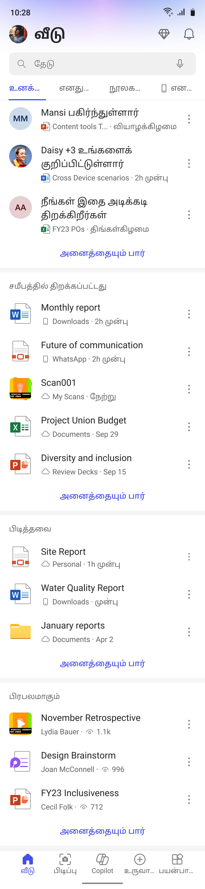 Longer scripts
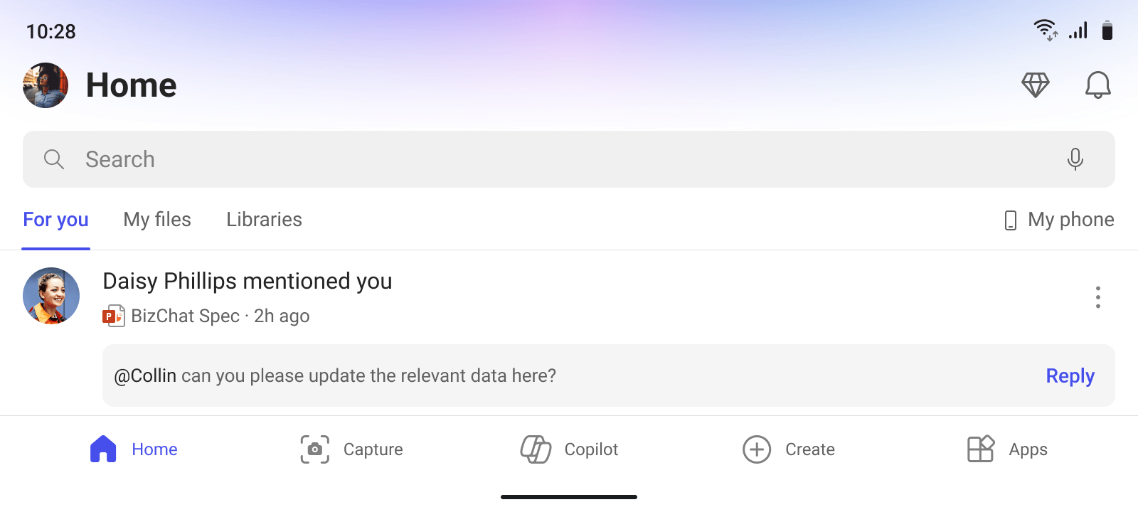 Landscape
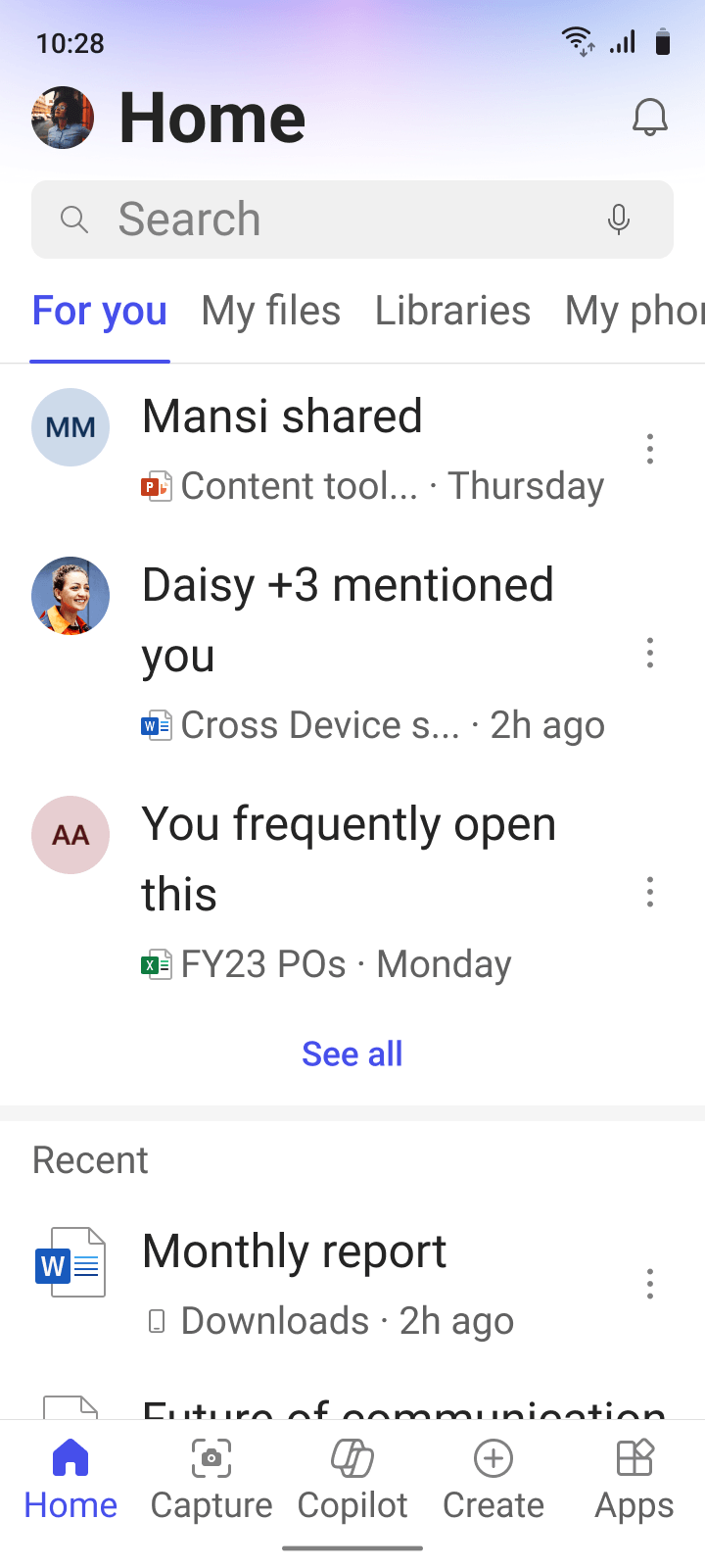 150% font
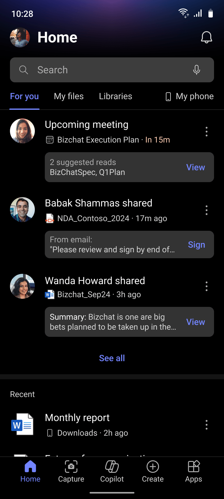 Dark mode
I designed For You and My Phone, and built and maintained the design system. Our small but mighty team worked across several PMs per feature area and three engineering leads.


Looking back
Redesigning the first screen of a product 128 million people already use meant demoting the one thing every one of them knew how to find. "Recently opened" didn't disappear. It moved one section down, so the new default could earn its place without taking anything away.
Building our own design system in five months forced a tradeoff I still think about. Fluent couldn't do what we needed, and every change there had to account for every surface across Microsoft. We shipped ours and aligned after. Waiting has a cost too, and sometimes catching up is cheaper than standing still.
With Microsoft Graph, the data was there. The hard part was deciding what mattered, and in what order. It worked, but next time I'd test precision earlier. Defining relevance is a design problem. Proving you got it right is a measurement problem.
The constraint I still think about is the one we couldn't touch. We owned how people found their files. We didn't own what happened after they opened one: editing and reading belonged to other teams. Whether the other side matched was out of our hands.
Interview excerptShoro consistently brings fresh perspectives to the table and demonstrates strong follow-through.
Interview excerptI liked the way you think in terms of constraints and how the design scales, this is very important for improving the quality of implementation.
Interview excerptYou challenge existing paradigms and offer alternatives to the problem at hand.
Interview excerptAn active voice who is seen challenging the status quo and standing by what is right for the users and the projects.